
Our Portfolio
Here’s where we share our recent work and insights on our process. Scroll down to see everything or select a category below to narrow your focus.
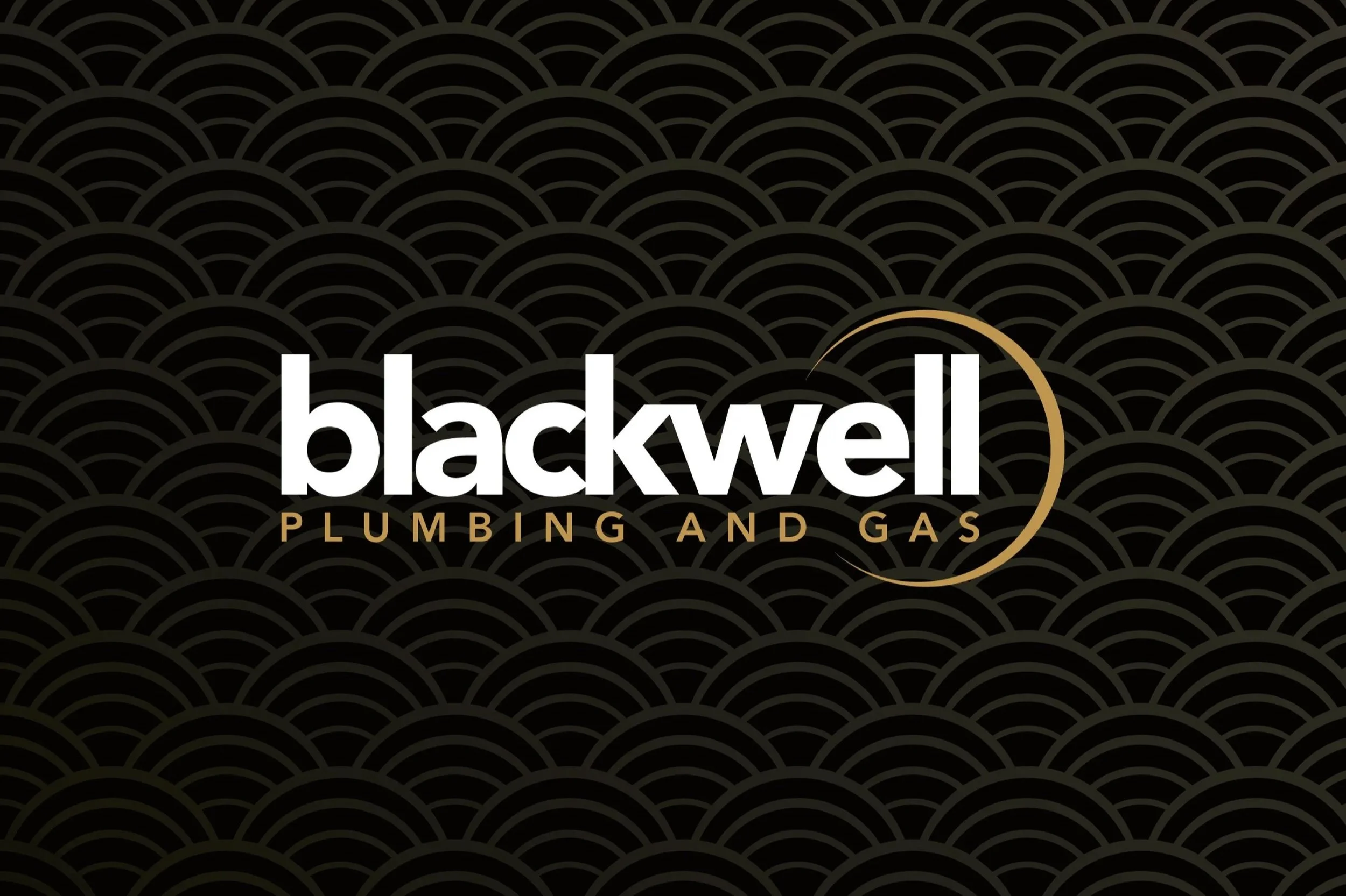
A visual identity for an established brand — Blackwell Plumbing and Gas brand refresh.
Blackwell Plumbing has been doing great work around the Wellington Region for many years now and approached Tailwind to help them raise the standard of their branding to match! They wanted to keep their existing logo intact, but we made some minor tweaks to improve legibility. The focus of the project was on creating a new visual identity and applying this to a range of collateral, including a new website, stationery, and vehicle graphics.
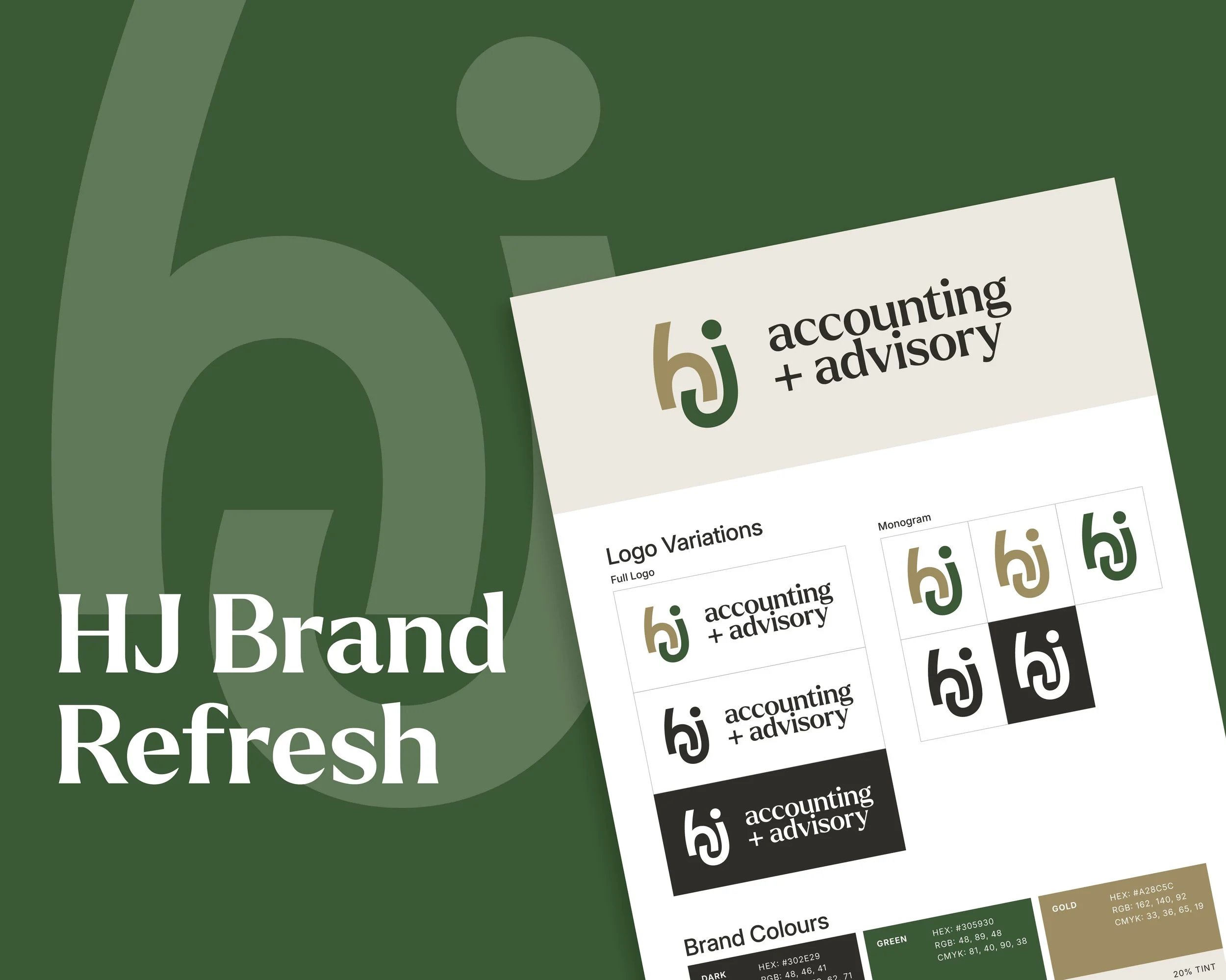
HJ Accounting + Advisory — A fresh brand for a fresh direction!
In 2019, new owners Helen and Alistair McEwen took over Hetherington Johnston Chartered Accountants. A highly-regarded local accountancy firm, started in 1989. In 2026 they came to us needing to refresh the brand to reflect where the company is at and where it is headed.
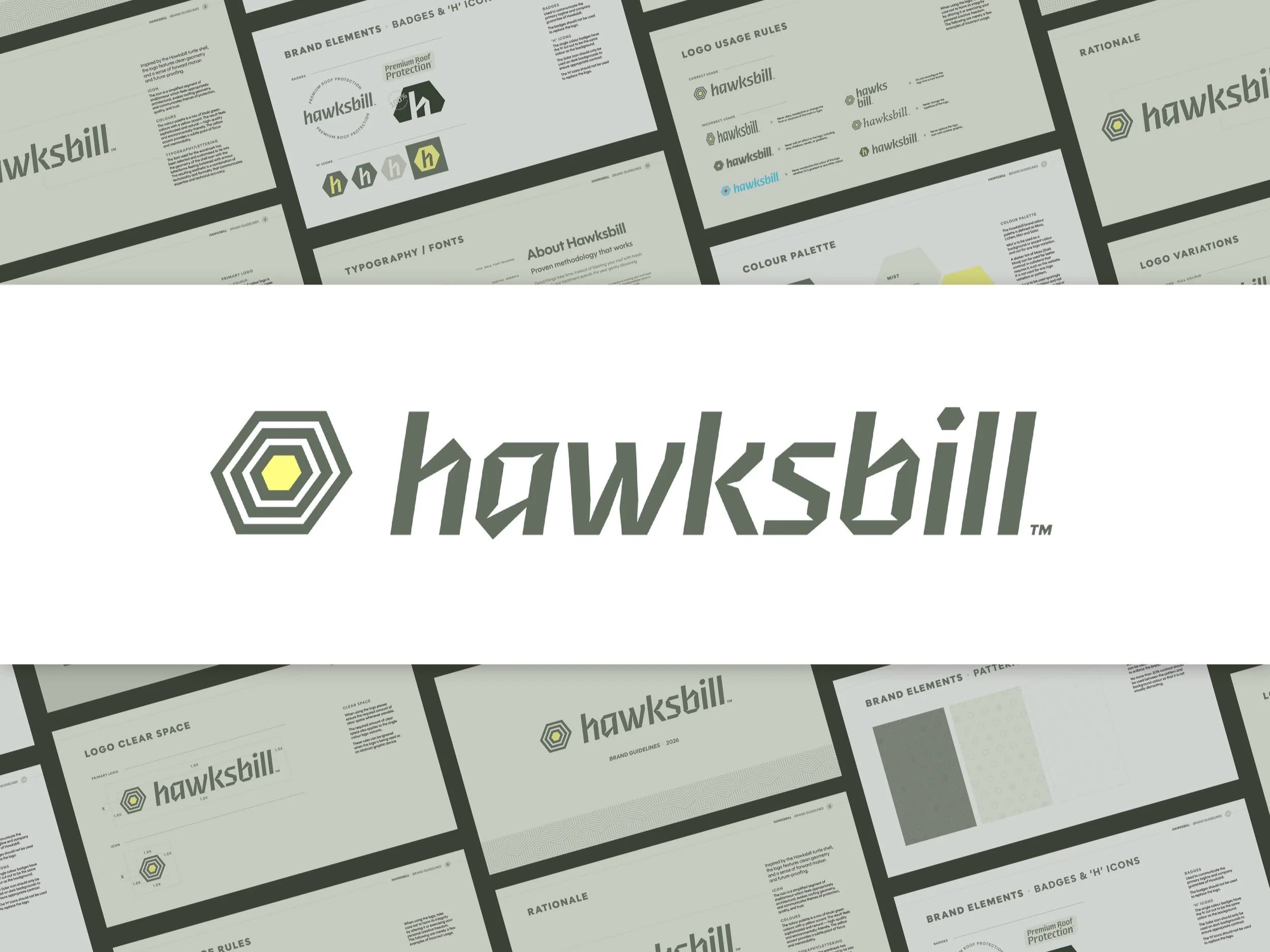
A new brand, built from the name up.
Hawksbill draws from the Hawksbill turtle which is a species known for its protective shell and longevity. That metaphor is perfect for a brand that delivers durable, reliable protection for the life of a home. This positions the brand as a long-term partner in roof protection.
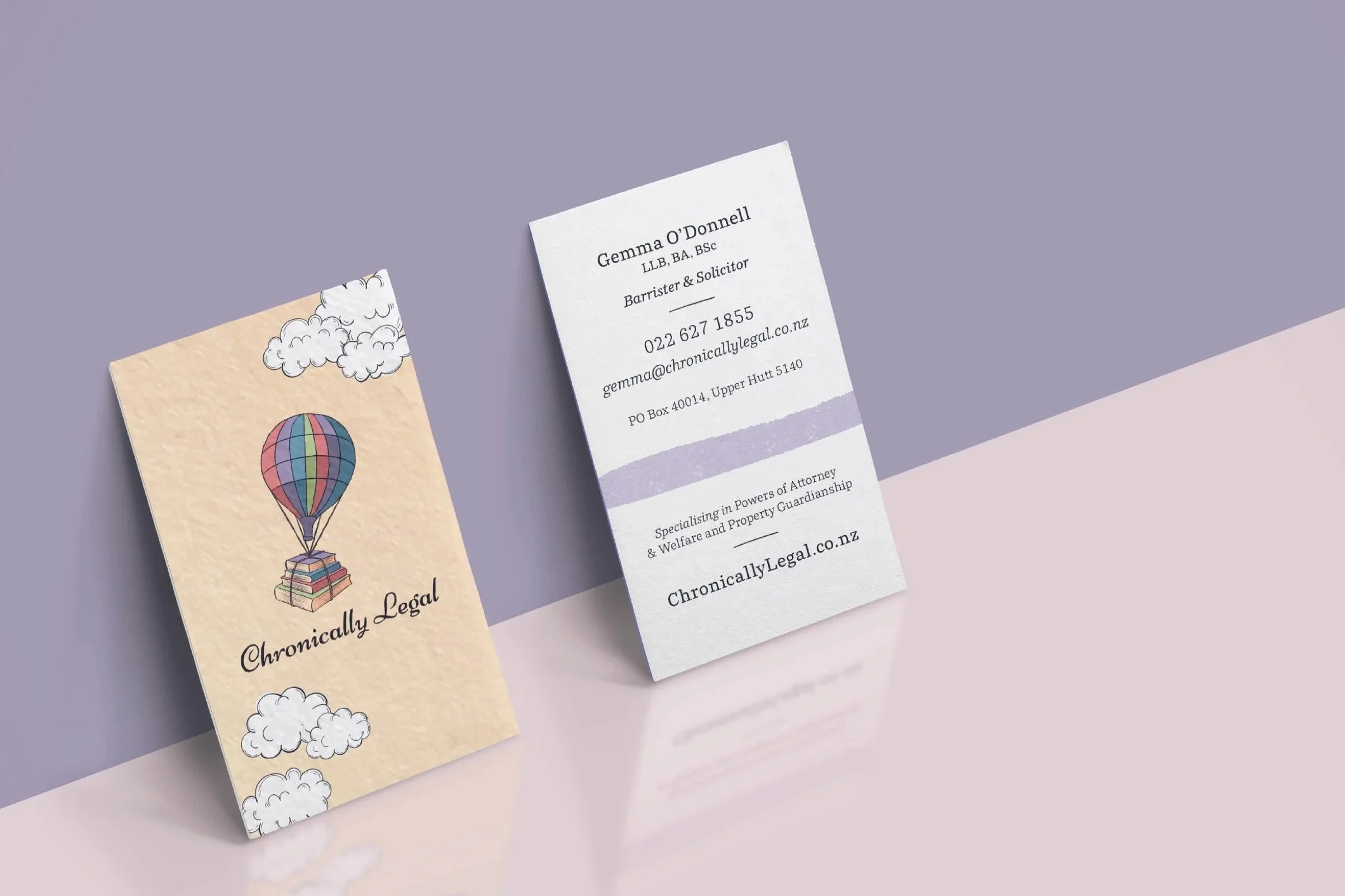
Expanding the visual identity of Chronically Legal
Your Logo doesn’t have to change!
Expanding the visual identity of Chronically Legal 🌤️
A lot of our work involves creating new brands or refreshing old ones. So you might assume we only work with brands that we’ve (re)designed ourselves. That’s not always the case! Chronically Legal is a great example.
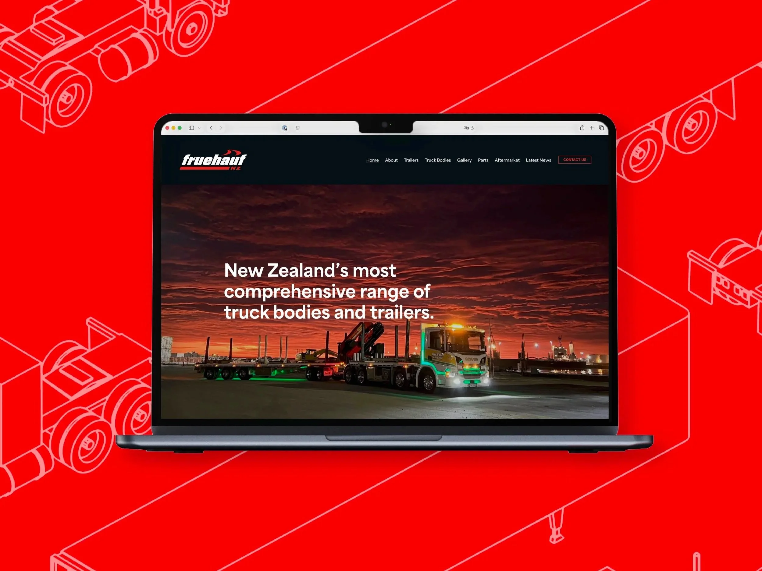
A Brand Evolution for Fruehauf NZ
Fruehauf is recognised as one of the country’s leading truck body and trailer builders. We were thrilled to support the company to achieve their goal of revitalising the brand and visual identity!
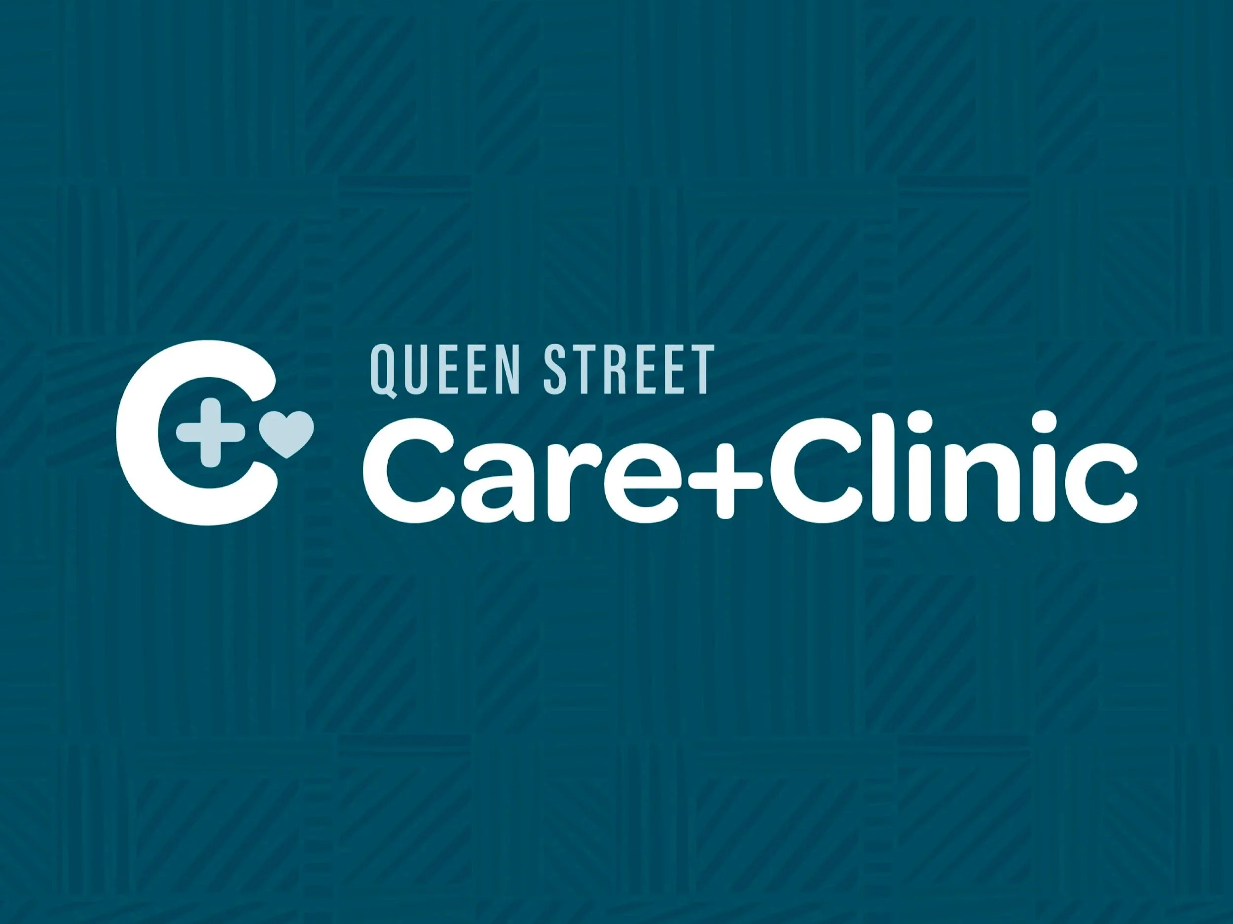
New brand system to support expanded services!
Tailwind Branding & Design teamed up with Queen Street Pharmacy to branch out of a typical pharmacy structure. They are proud of their approach to offer clinics that typical pharmacies may not provide. With a view to adding more of these clinics and needing to market them separately, the Care+Clinic brand was created.
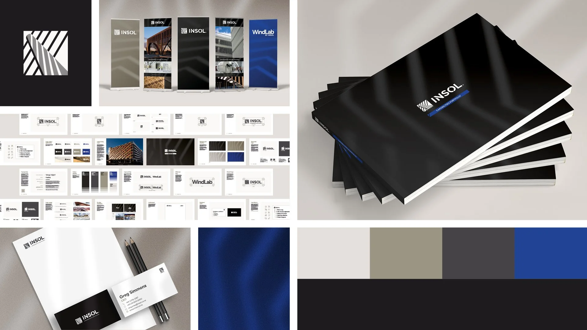
Built to Last: Refreshing Insol’s Brand
Tailwind was engaged to undertake a brand review and subsequent refresh, helping to unify Insol’s visual language and strengthen the presentation of their projects and product offerings.

Goldes Developments, a high–end, understated brand.
We love to reflect the passion and professionalism of a business with great branding! Jan and Bill Peryer of Goldes Developments came to us with the goal of giving their business a high-end and subtle visual identity. They’d been running for years under the radar, so we relished the opportunity to highlight what they are about!

Launching Valley Skin Checks: A Bold Vision Brought to Life in Just Two Months
Tailwind created the full brand for Valley Skin Checks—from strategy and identity through to a new website, team photography, advertising, collateral, and a complete signage package.

Elevating Beta One with a refreshed logo and brand identity
Beta One asked Tailwind to help elevate their brand as they launch their new business. We refreshed their logo by simplifying the form, improving the colour palette, refining the typography, and modernising the T-cell visual metaphor for better clarity, professionalism, and impact.

Re-imagining Tradie Alley: Rebranding Project
We love to re-imagine a brand at Tailwind! This project was a lot of fun. The team at Tradie Alley were looking for a fresh approach to their existing brand that they had created themselves.

Giving ProWire Electrical a Head-start
We gave ProWire Electrical a brand design that is as good as any of their competitors. This is a perfect example of one of our 'Level Up Packages’ and now ProWire is all set for the next decade or more.
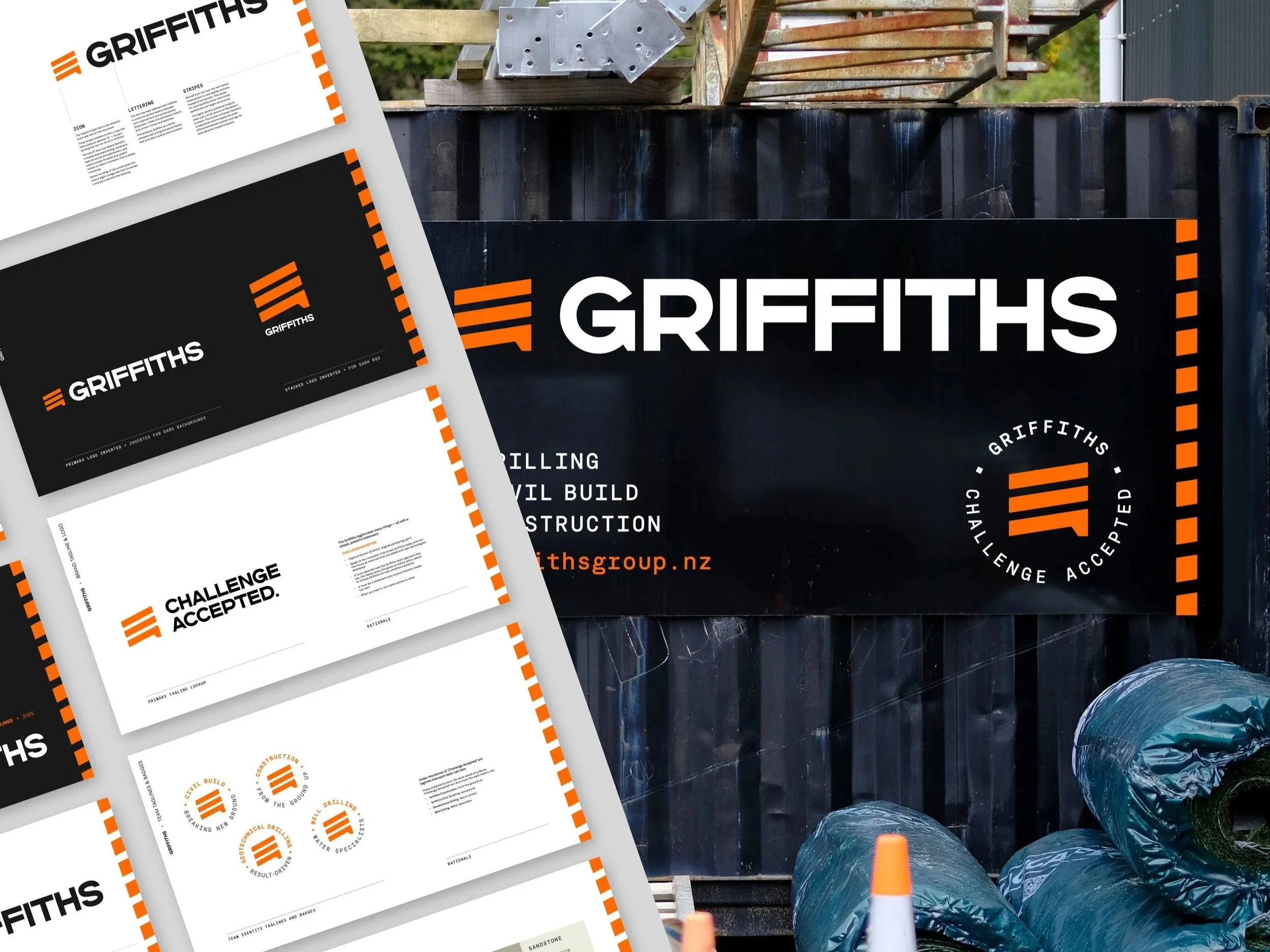
Brand Refresh for Griffiths
Griffiths partnered with Tailwind to undertake a strategic rebranding to mark a new chapter for the company, streamlining its operations and presenting a cohesive identity to the market.

New brand identity for ManaBuilt
A new brand identity for ManaBuilt, a local building company operating since 2006, that reflects its core values of quality workmanship, integrity, and cultural pride.

Brand Design for Mana Mauri
The logo strongly whakapapas to maunga and to Papatūānuku and Ranginui. The elements all come together in the shape of a waka symbolising navigation.
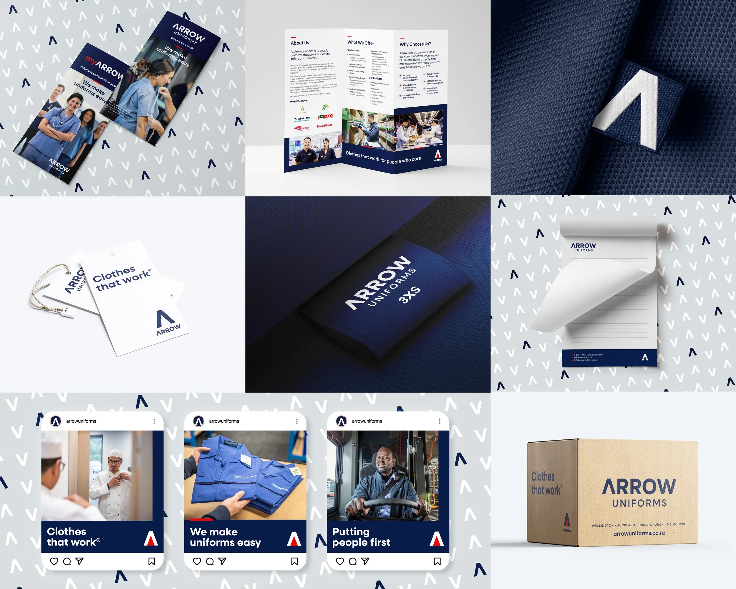
Revitalising Arrow Uniforms
Arrow Uniforms approached Tailwind to refine and improve their branding, marketing, and language, which had grown disparate over the years and was not reflective of just how awesome this industry-leading nationwide company is.
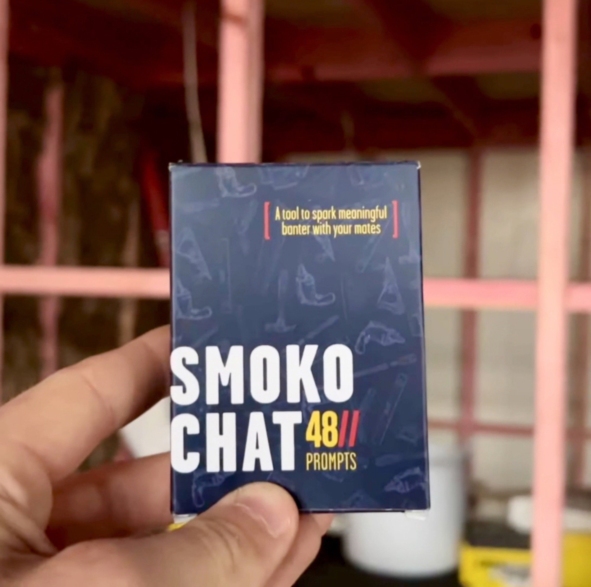
Smoko Chat Card Game
Tailwind was commissioned to design the new card game Smoko Chat to spark meaningful conversations in the workplace.
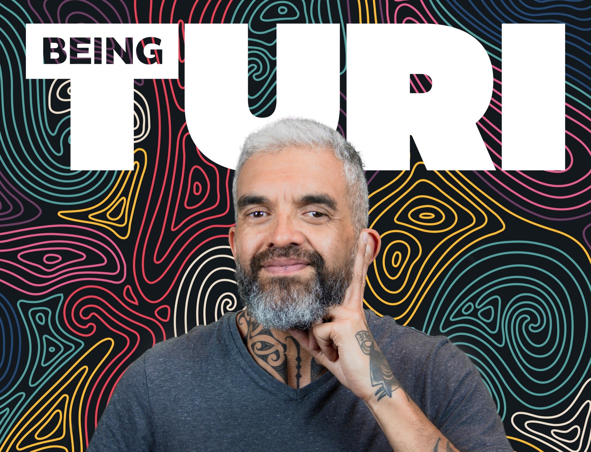
Series Identity and Marketing for ‘Being Turi’
The Tailwind team is honoured to have played a small part in the making of this incredible documentary series.

Tailwind Wins Awards for Te Kupenga o Rongomai Maidstone Sports Hub
After designing this community hub's branding, Tailwind was tasked with creating an effective wayfinding system and implementing a strong visual identity throughout the Te Kupenga o Rongomai building.
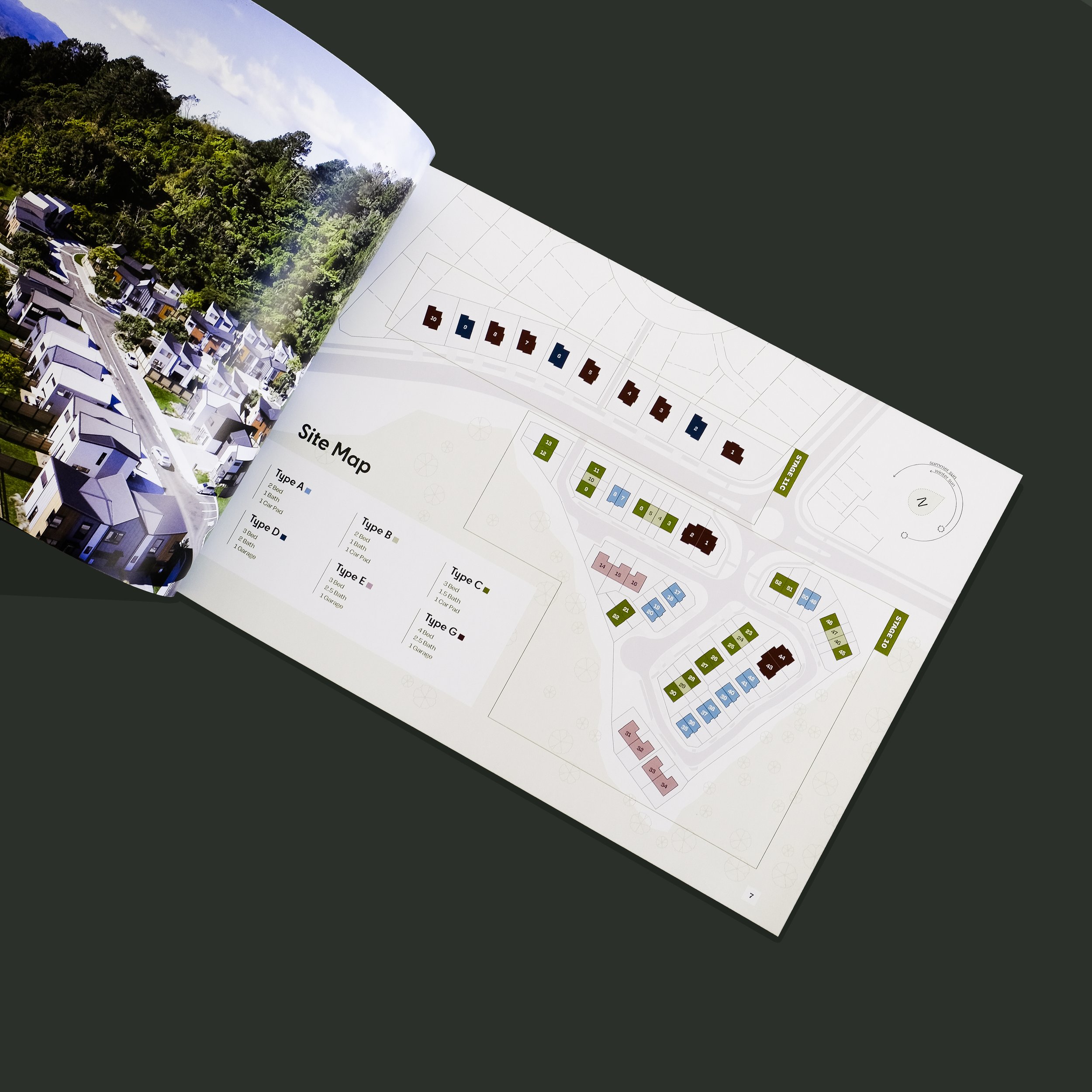
Branding and Marketing for Real Estate Development
The marketing booklet carries through the brand’s angular feel with ‘anchored’ imagery, a tag system and geometrical ‘arrow’ devices echoing the logo.