New brand system to support expanded services!
Late last year, longtime friends of Tailwind, Queen Street Pharmacy , approached us to help with their new Care+Clinic project. Queen Street Pharmacy is proud of its approach to offer clinics that typical pharmacies may not provide. With a view to adding more of these clinics and needing to market them separately, the Care+Clinic brand was created. We enjoyed the challenge of using existing Queen Street Pharmacy fonts and colours to create a familiar new brand with a system that allows sub-brands to live within it.

The parent brand has a friendly yet professional aesthetic complete with patterns and a distinctive emblem.
We enjoyed the challenge of using existing Queen Street Pharmacy fonts and colours to create a familiar new brand with a system that allows sub-brands to live within it. The parent brand has a friendly yet professional aesthetic complete with patterns and a distinctive emblem.
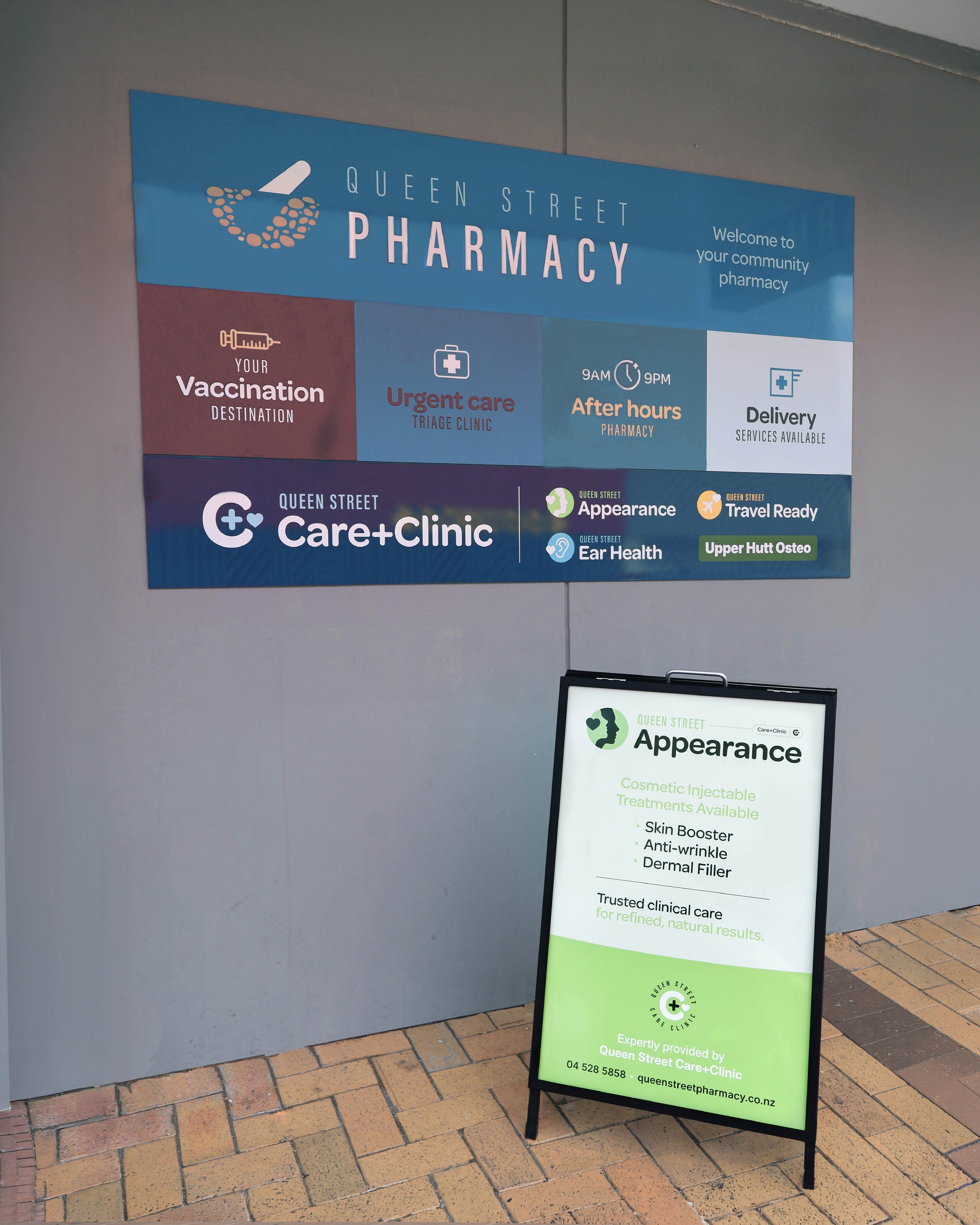
Some new signage was recently installed that we designed to show an overview of pharmacy services as well as the Care+Clinic offering. And a fantastic new footpath sign to highlight the new Queen Street Appearance clinic.
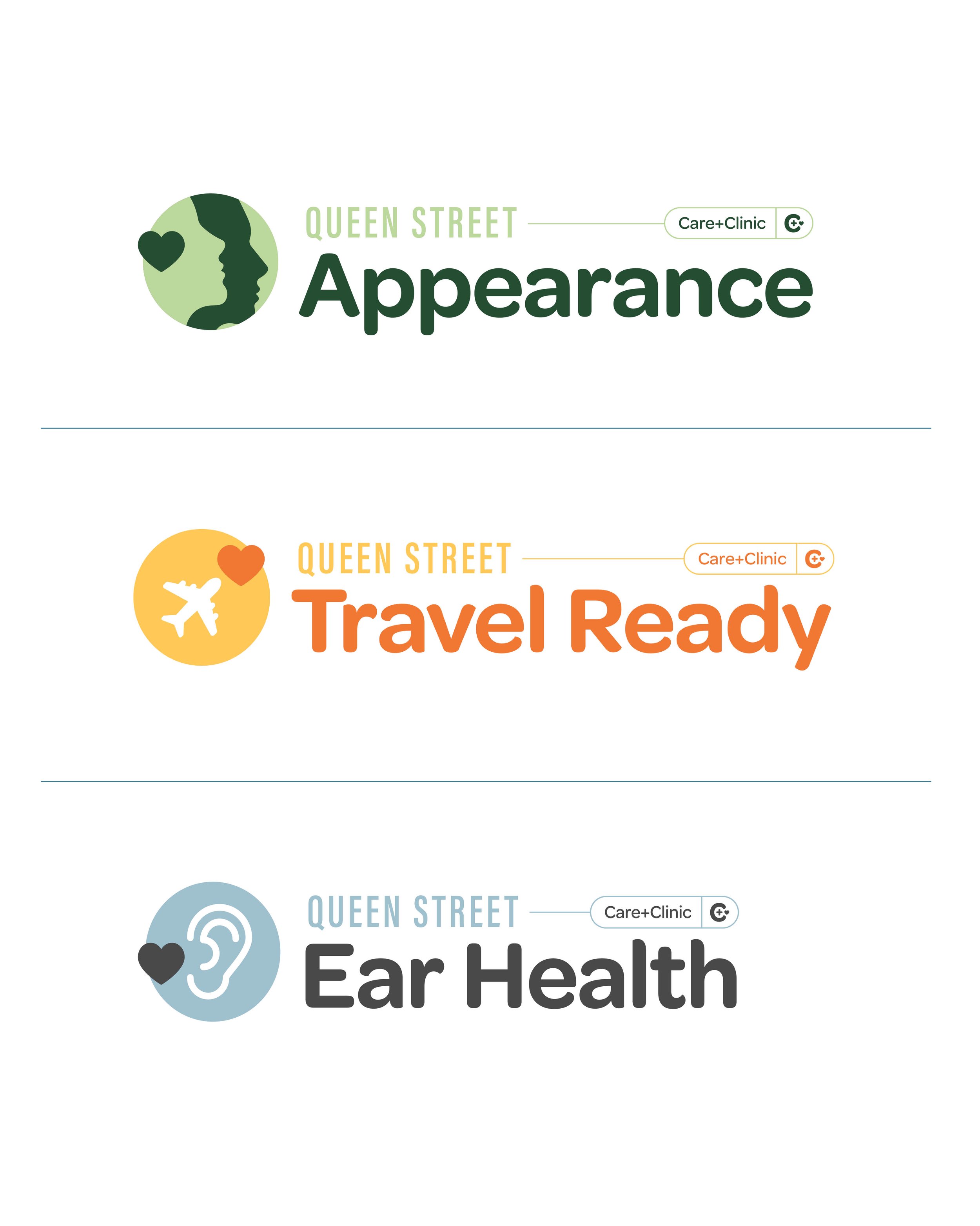
The sub-brands follow a template that uses complementary colours, iconography with a ‘heart’ linking element, consistent layout, and an optional ‘Care+Clinic’ tag.

If your business is growing with new products or services, we’d love to hear about your goals so we can craft a brand strategy to make it great!