
Our Portfolio
Here’s where we share our recent work and insights on our process. Scroll down to see everything or select a category below to narrow your focus.
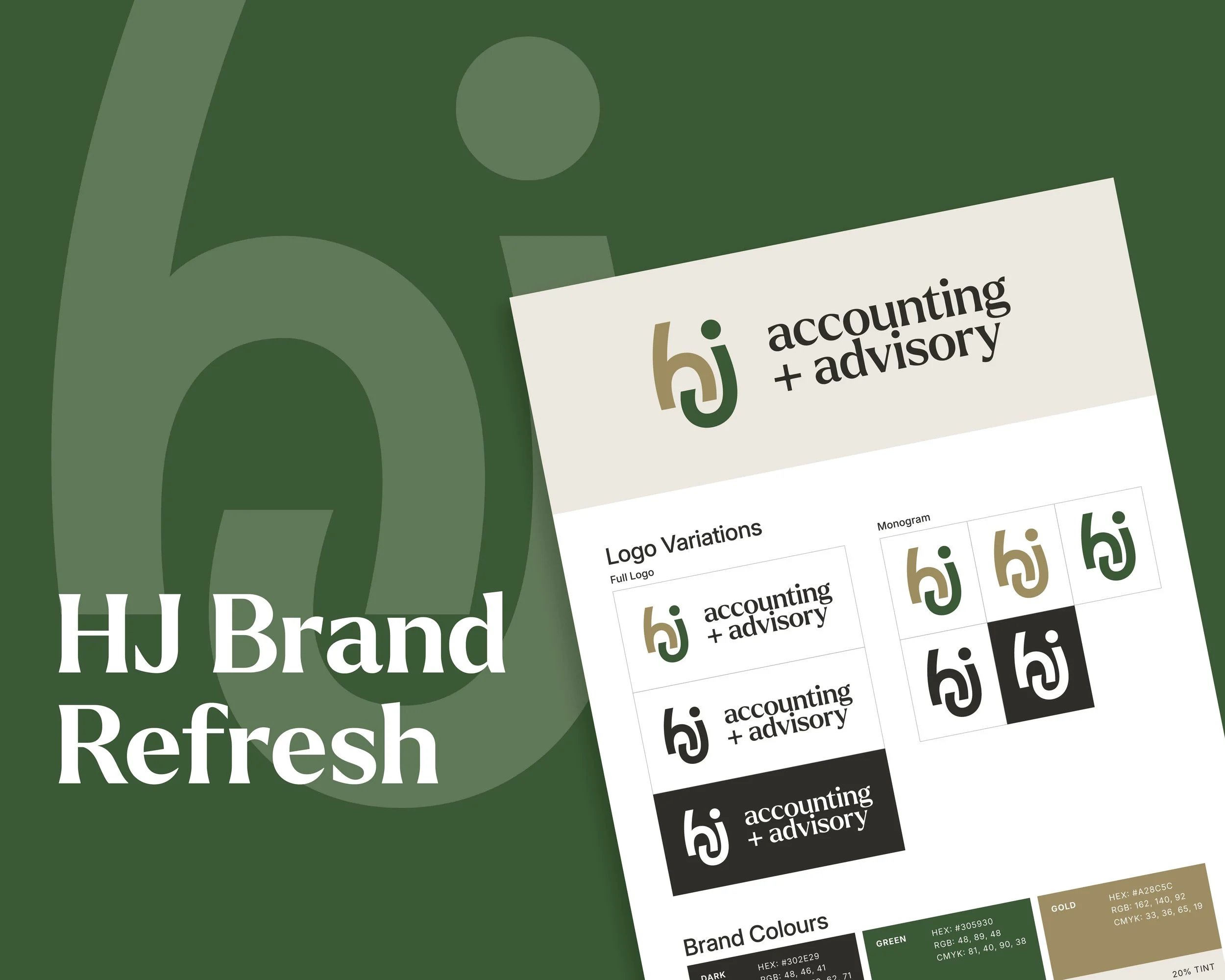
HJ Accounting + Advisory — A fresh brand for a fresh direction!
In 2019, new owners Helen and Alistair McEwen took over Hetherington Johnston Chartered Accountants. A highly-regarded local accountancy firm, started in 1989. In 2026 they came to us needing to refresh the brand to reflect where the company is at and where it is headed.
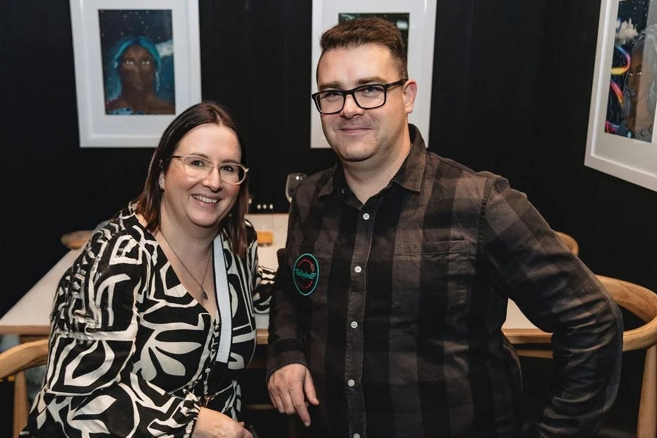
Proud to be Creative Gold Finalists in the 2026 Gold Awards!
On Friday the 8th of May Josh and Jess attended the finalist announcement event at Te Wharewaka o Pōneke. We are incredibly grateful to be recognised alongside previous winners such as Weta Digital, Werk Agency, Massey – College of Creative Arts and Bats Theatre.
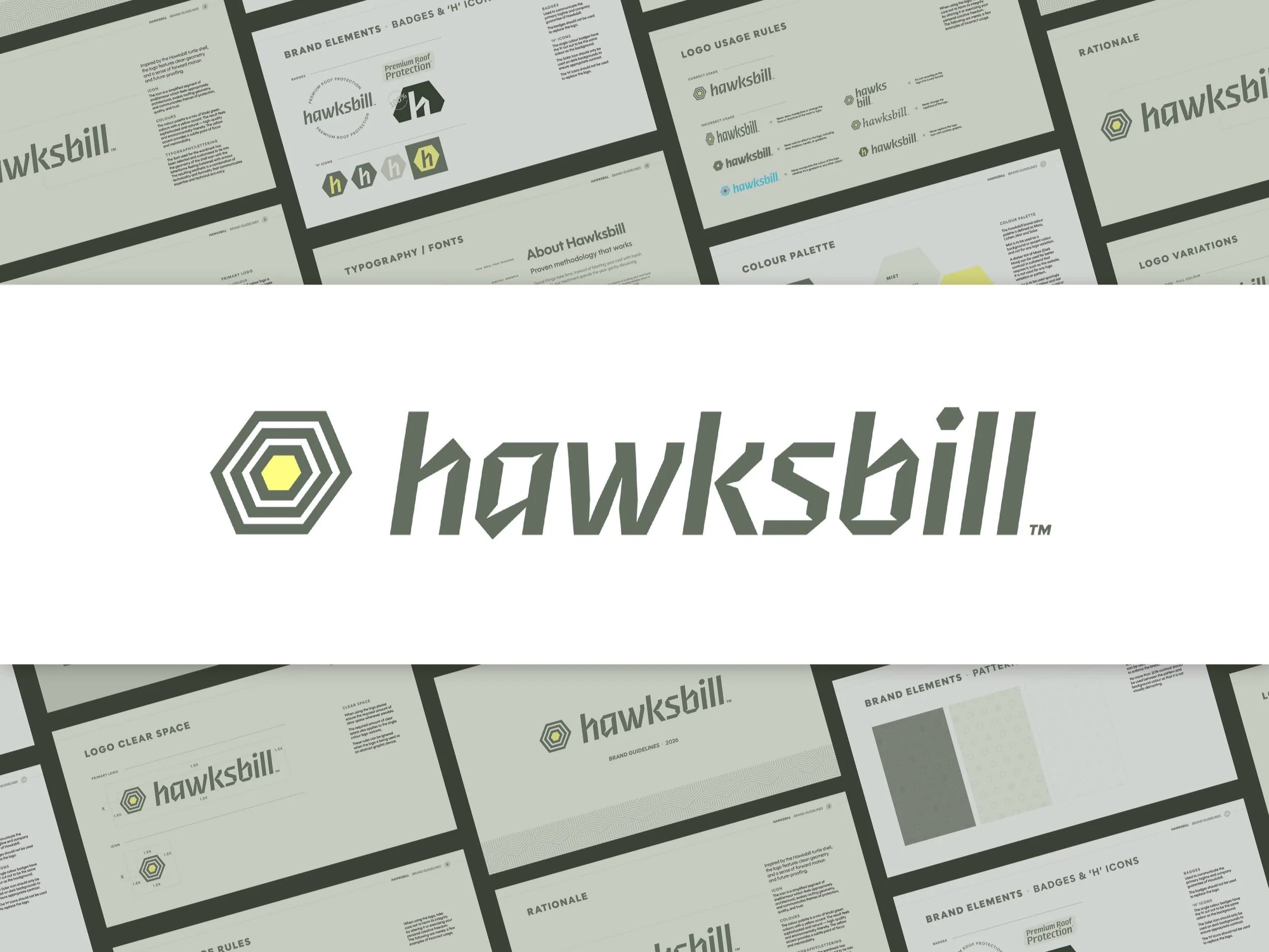
A new brand, built from the name up.
Hawksbill draws from the Hawksbill turtle which is a species known for its protective shell and longevity. That metaphor is perfect for a brand that delivers durable, reliable protection for the life of a home. This positions the brand as a long-term partner in roof protection.
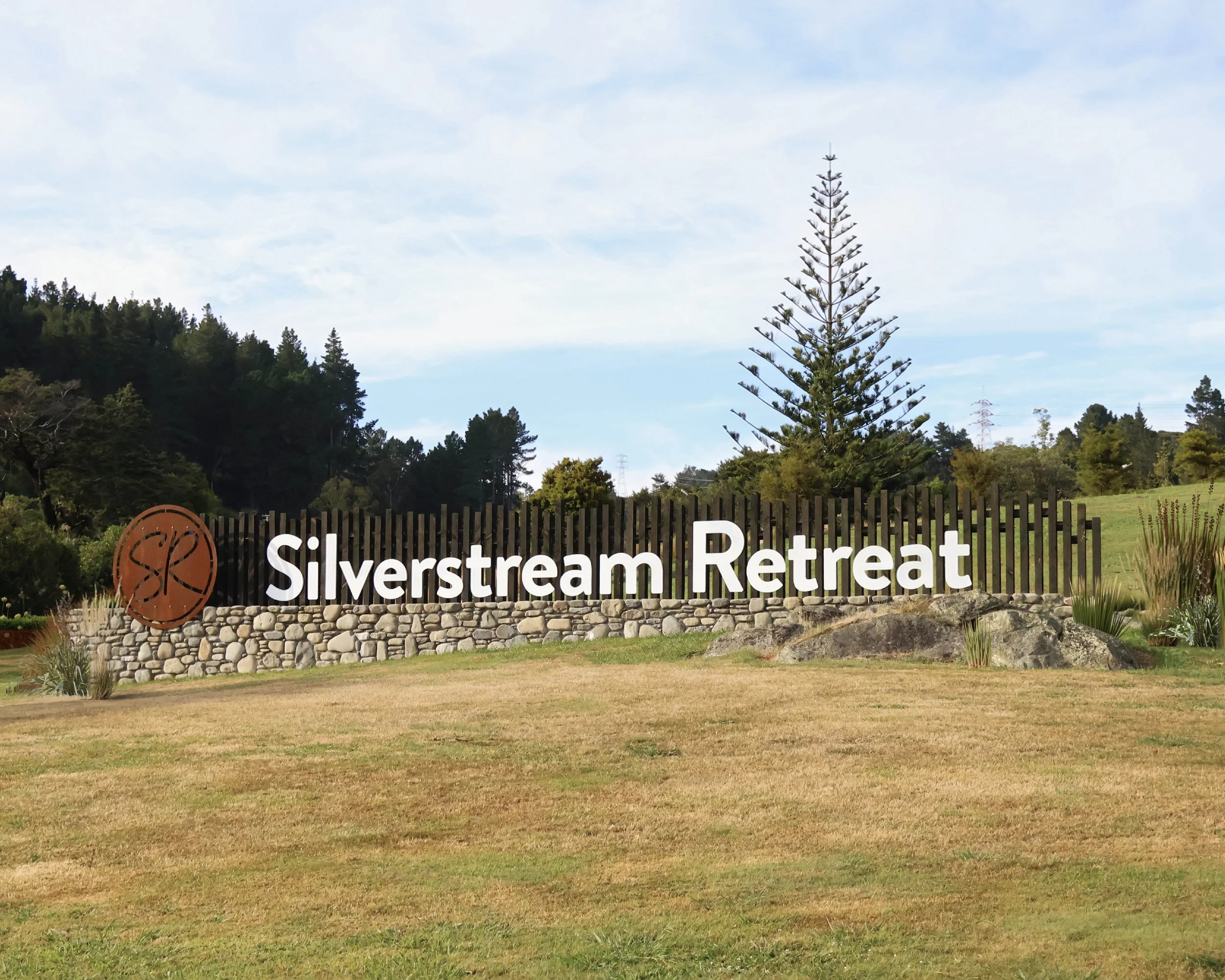
A stunning monument sign for Silverstream Retreat
A stunning monument sign for Silverstream Retreat , We were tasked with designing a new entrance sign using an existing river stone wall at this amazing local events and accommodation venue. This combination of practicality and appealing visuals is what good design is all about!
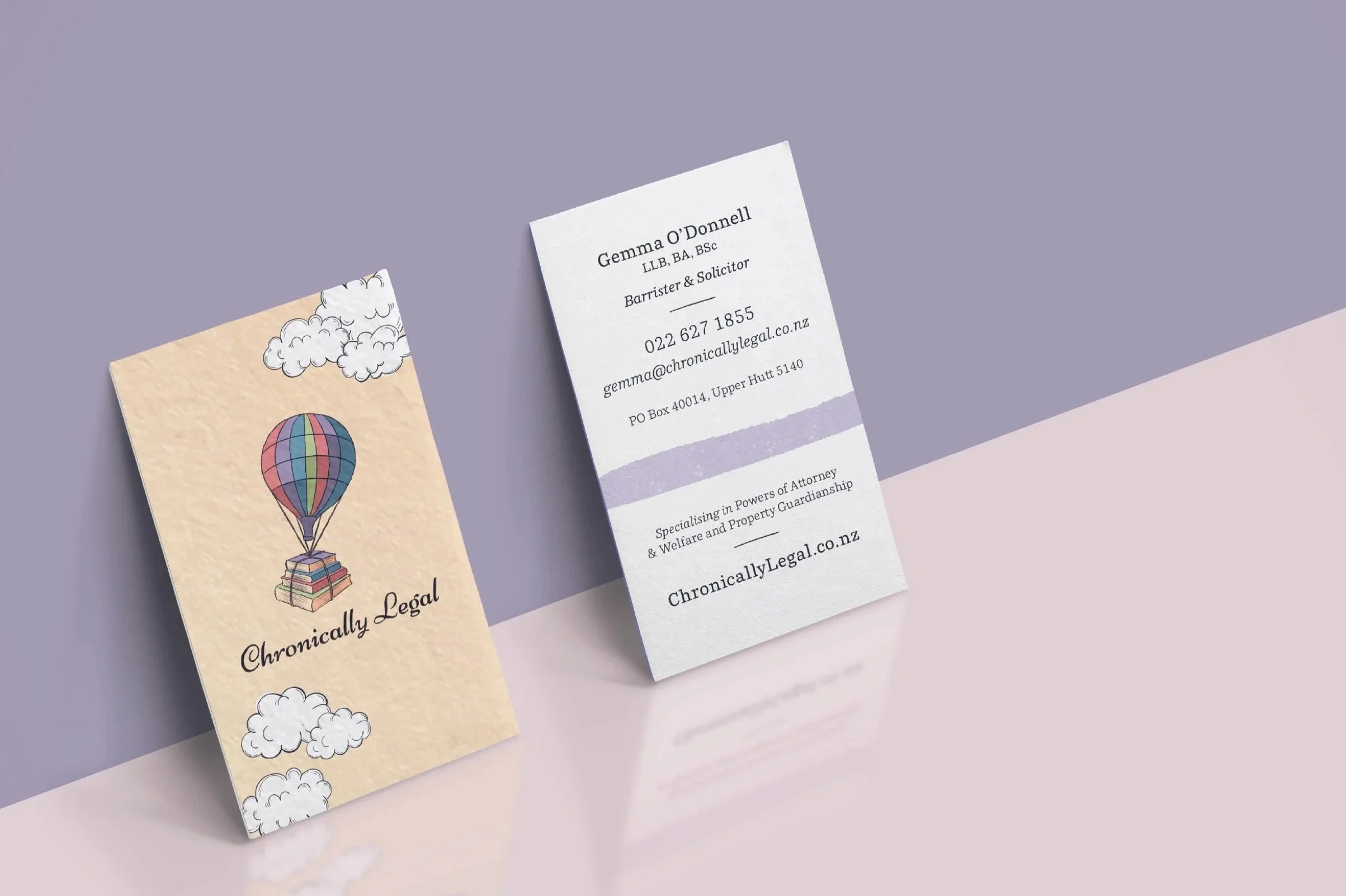
Expanding the visual identity of Chronically Legal
Your Logo doesn’t have to change!
Expanding the visual identity of Chronically Legal 🌤️
A lot of our work involves creating new brands or refreshing old ones. So you might assume we only work with brands that we’ve (re)designed ourselves. That’s not always the case! Chronically Legal is a great example.

A Brand Evolution for Fruehauf NZ
Fruehauf is recognised as one of the country’s leading truck body and trailer builders. We were thrilled to support the company to achieve their goal of revitalising the brand and visual identity!
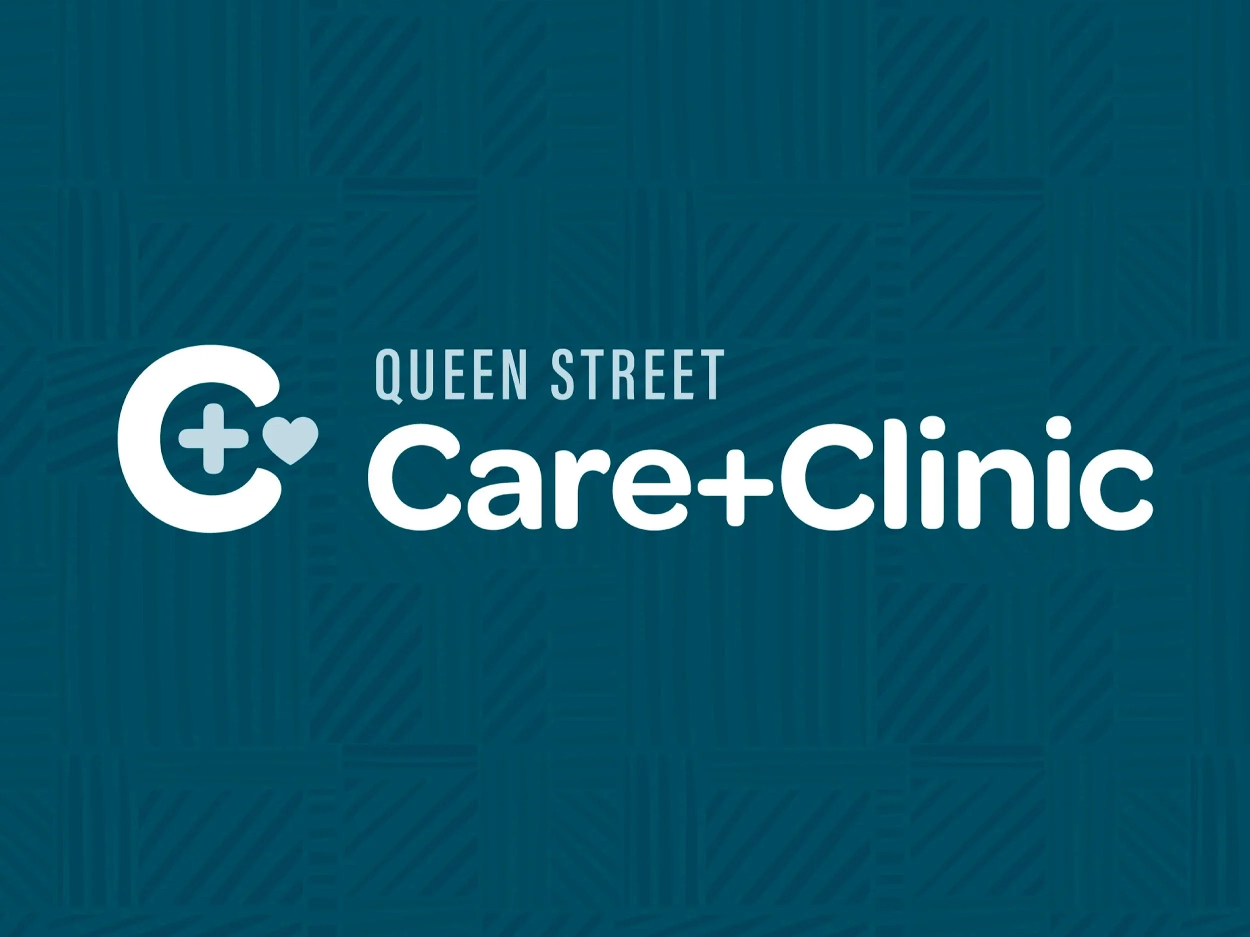
New brand system to support expanded services!
Tailwind Branding & Design teamed up with Queen Street Pharmacy to branch out of a typical pharmacy structure. They are proud of their approach to offer clinics that typical pharmacies may not provide. With a view to adding more of these clinics and needing to market them separately, the Care+Clinic brand was created.

Continuing to elevate the Jarvis brand!
We rebranded the local plumbing heroes Jarvis Plumbing & Gasworks a few years back. Since then we have continued to support this awesome business with top-notch design and marketing.
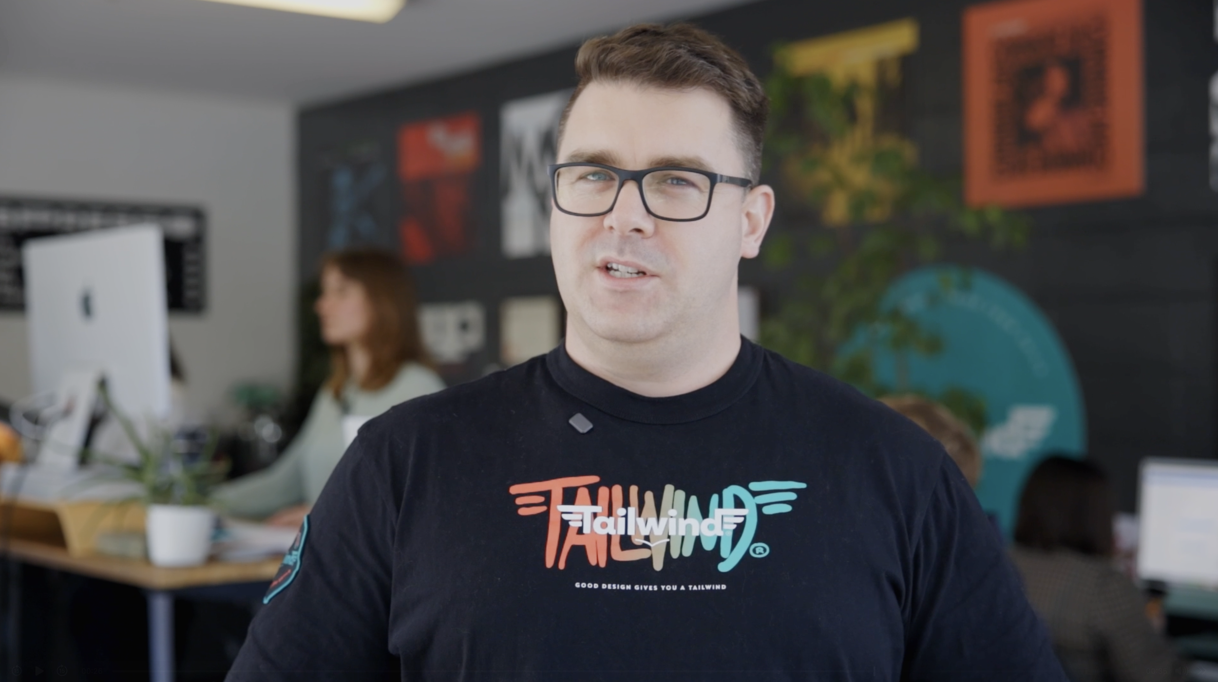
A Snapshot into the Team at Tailwind
Here’s a quick snapshot about our fantastic team and what makes Tailwind great a partner for your business! This video was presented at the 2025 2degrees Wellington Regional Business Excellence Awards where we won Best Small Business.
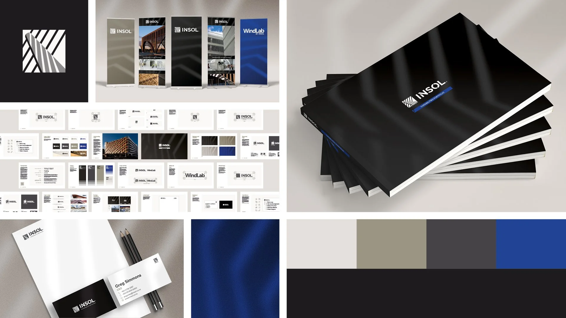
Built to Last: Refreshing Insol’s Brand
Tailwind was engaged to undertake a brand review and subsequent refresh, helping to unify Insol’s visual language and strengthen the presentation of their projects and product offerings.
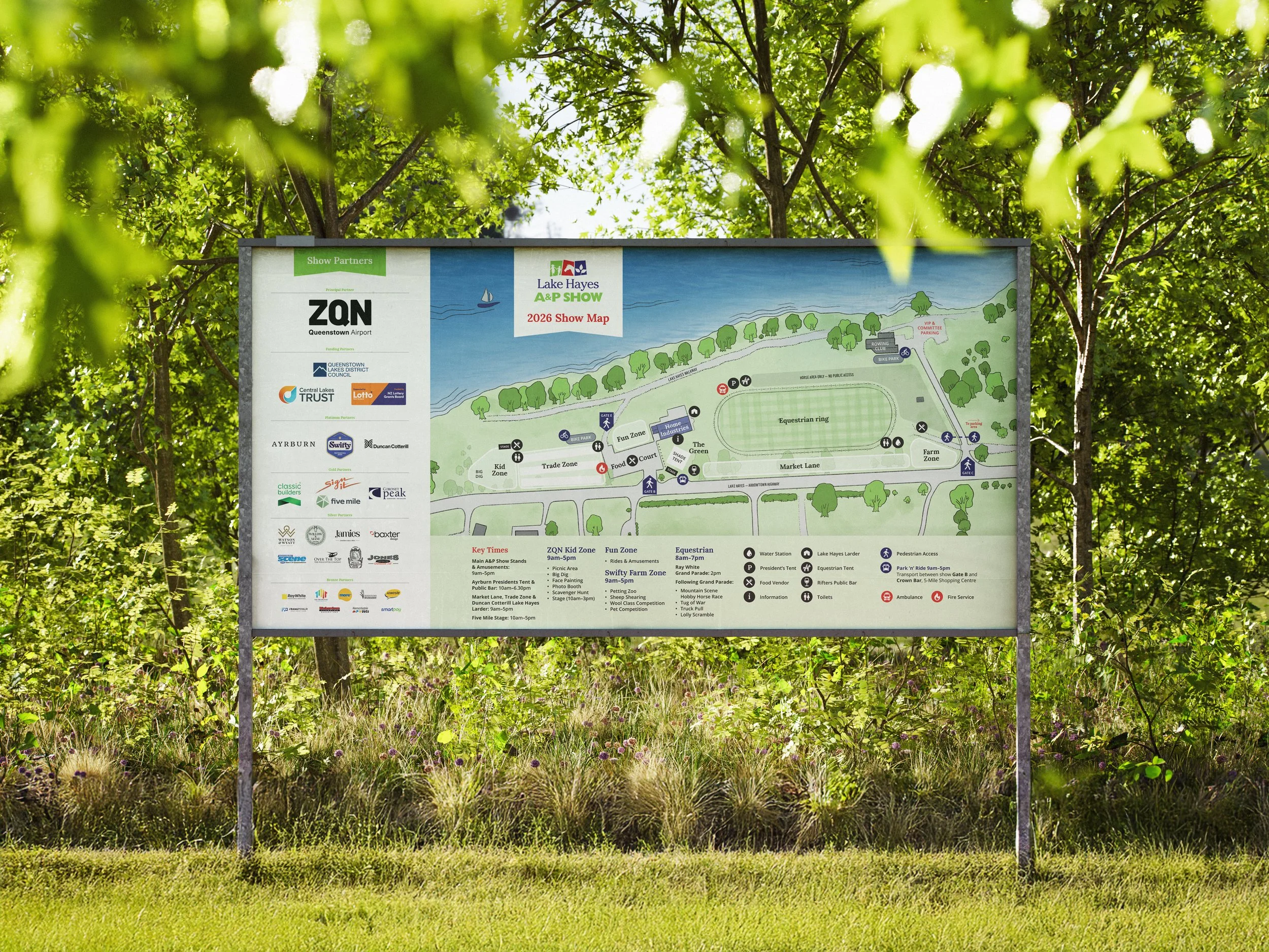
Practical Design Solutions for the Lake Hayes A&P Show
For Lake Hayes A & P Show, Tailwind designed a custom, artistic map base of the show grounds and surrounding area, then added map details tailored to each year. We produced a full set of maps for access, parking, vendors, setup, signage, and the website.

Goldes Developments, a high–end, understated brand.
We love to reflect the passion and professionalism of a business with great branding! Jan and Bill Peryer of Goldes Developments came to us with the goal of giving their business a high-end and subtle visual identity. They’d been running for years under the radar, so we relished the opportunity to highlight what they are about!

Design that Grows with your Business
Supporting our clients as they adapt, evolve, and put their best foot forward. Helium is a financial planning and investment advice company for which we developed the branding in 2024. The business is constantly learning, innovating, and evolving. As its market position and target audience have shifted, the brand required a refreshed presentation.

Launching Valley Skin Checks: A Bold Vision Brought to Life in Just Two Months
Tailwind created the full brand for Valley Skin Checks—from strategy and identity through to a new website, team photography, advertising, collateral, and a complete signage package.

Tailwind Wins Wellington Region’s Best Small Business!
Tailwind was proud to be judged the winner of Best Small Business at the 2025 2Degrees Wellington Regional Business Excellence Awards!

Elevating Beta One with a refreshed logo and brand identity
Beta One asked Tailwind to help elevate their brand as they launch their new business. We refreshed their logo by simplifying the form, improving the colour palette, refining the typography, and modernising the T-cell visual metaphor for better clarity, professionalism, and impact.

Website Refresh for Roslyn Pharmacy
A new website for Dunedin’s Roslyn Pharmacy. We incorporated some of their new brand identity, new photography and video. Now the client is all set to manage their own website moving forward, with Tailwind to assist whenever needed.

Re-imagining Tradie Alley: Rebranding Project
We love to re-imagine a brand at Tailwind! This project was a lot of fun. The team at Tradie Alley were looking for a fresh approach to their existing brand that they had created themselves.

Proud to be Finalists for Best Small Business in the 2Degrees Wellington Regional Business Excellence Awards
We are immensely proud to be a finalist for Best Small Business at the 2Degrees Wellington Regional Business Excellence Awards! It also means we are eligible to win the People’s Choice Award — the award for the most public votes. Vote to help us win!

Giving ProWire Electrical a Head-start
We gave ProWire Electrical a brand design that is as good as any of their competitors. This is a perfect example of one of our 'Level Up Packages’ and now ProWire is all set for the next decade or more.