Elevating Beta One with a refreshed logo and brand identity

Fellow Hutt Valley Chamber of Commerce members, Beta One, recently approached Tailwind to help elevate their brand as they grow their presence and impact in the Type 1 diabetes community.
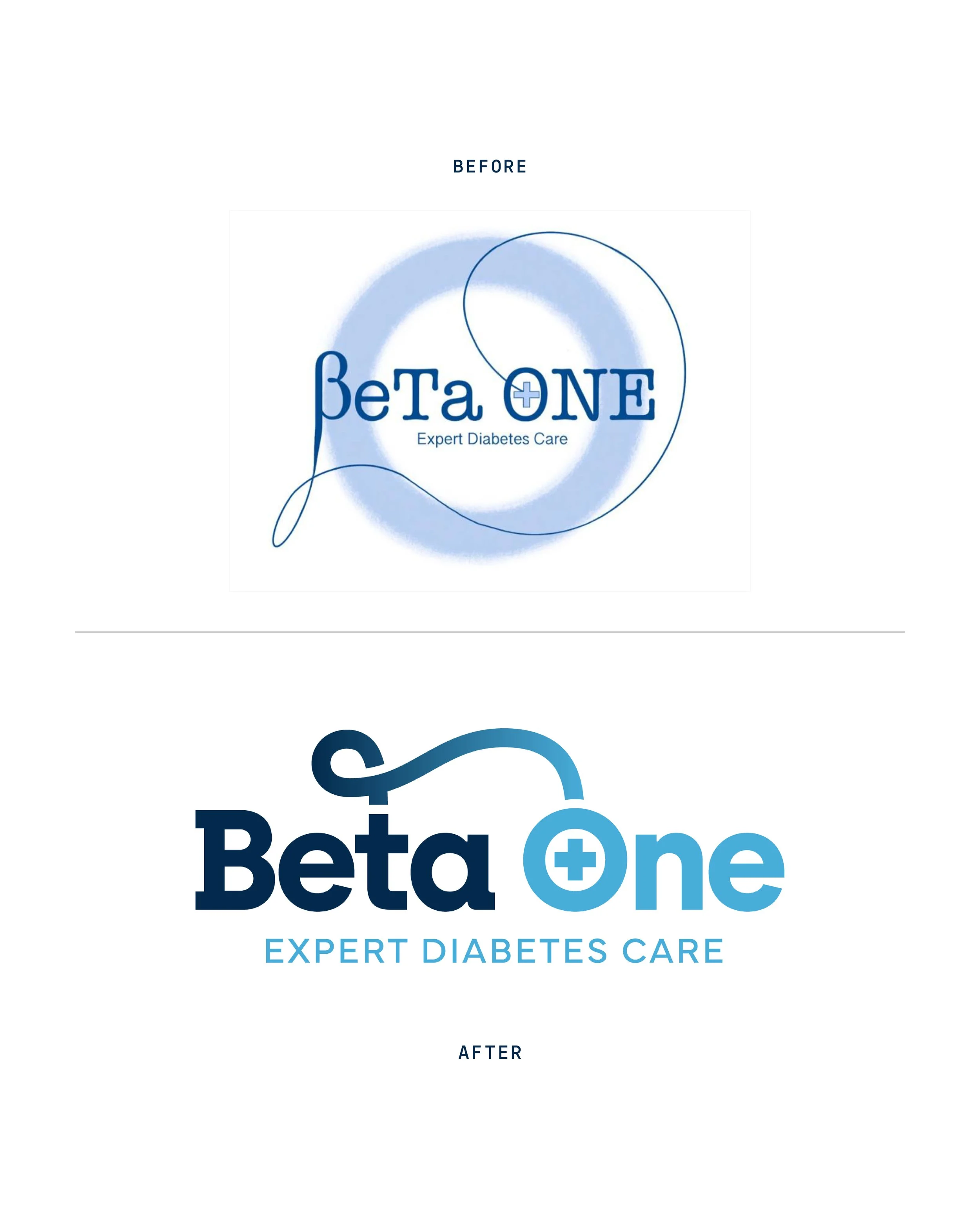
After reviewing their existing brand, we identified a few areas where the logo wasn’t performing as strongly as it could. The previous mark included very small details, leaned too literally on its metaphor, and lacked the refinement needed to position Beta One as a leading provider of Type 1 diabetes support.
A more refined, meaningful logo
The refreshed logo addresses these issues with a clearer, more contemporary approach:
Colour and tone: The original muted blues felt clinical, which worked—but they didn’t convey a sense of hope or progress. The refreshed palette still draws from blue to maintain clinical credibility, but introduces a brighter teal that communicates optimism and positive lifestyle change.
Name rendering: The former “BeTa ONE” styling aimed to reference T-cells and “Type 1,” but resulted in a clunky, hard-to-read wordmark. Streamlining this to “Beta One” gives the brand a calm, composed presence and shifts the emphasis from a text metaphor to a stronger, more intentional visual metaphor.
Gradient use: Adding a subtle gradient gives the logo a more modern feel and reinforces themes of advancement, momentum, and improved wellbeing.
Typography: The chosen font strikes a careful balance—technical and scientific enough to feel credible, yet friendly and professional enough to remain approachable.
T-cell connection element: While the T is now lowercase, its importance is maintained by making it the connecting point for the cord element. The cord has been simplified so it no longer wraps around the entire logo, improving clarity and ensuring the mark scales cleanly. Its thickness now matches the rest of the logo for a cohesive sense of proportion.
Circle and medical cross: The circular “O” shape still contains the medical plus symbol, but this too has been simplified for cleaner rendering and greater legibility.
Rolling out the refreshed brand
With the logo modernised, we brought the identity to life through a wider visual system. Tailwind created:
A fresh colour palette and supporting visual patterns
A new website built around clarity and trust
Canva templates to empower the Beta One team to manage their own social media
An improved Google Business Profile
A new set of business cards


Beta One is now equipped with a cohesive, future-ready brand presence—well positioned for their next phase of growth. And Tailwind will be right there to support them along the way. Just how we like it. 😊