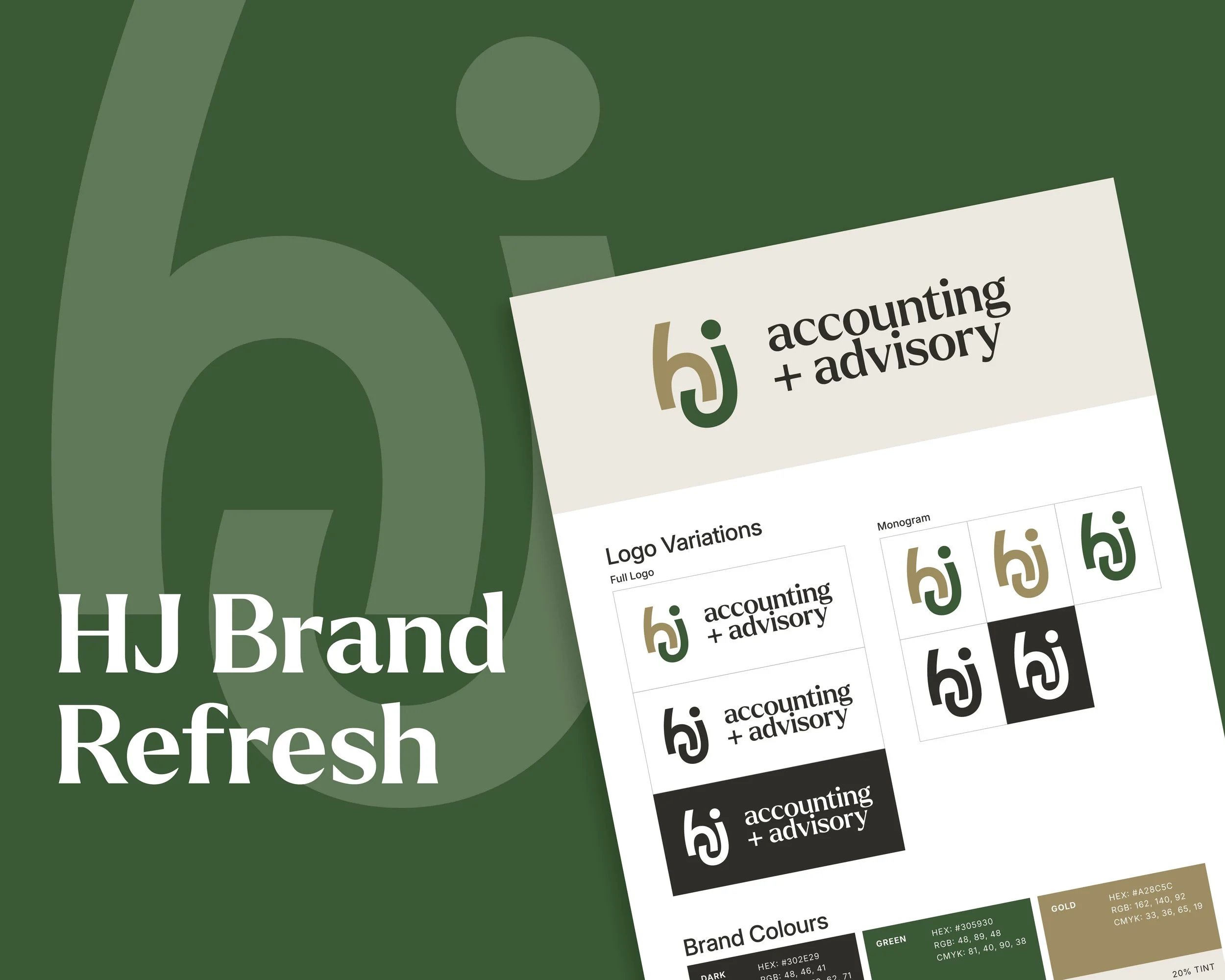
A new brand, built from the name up.
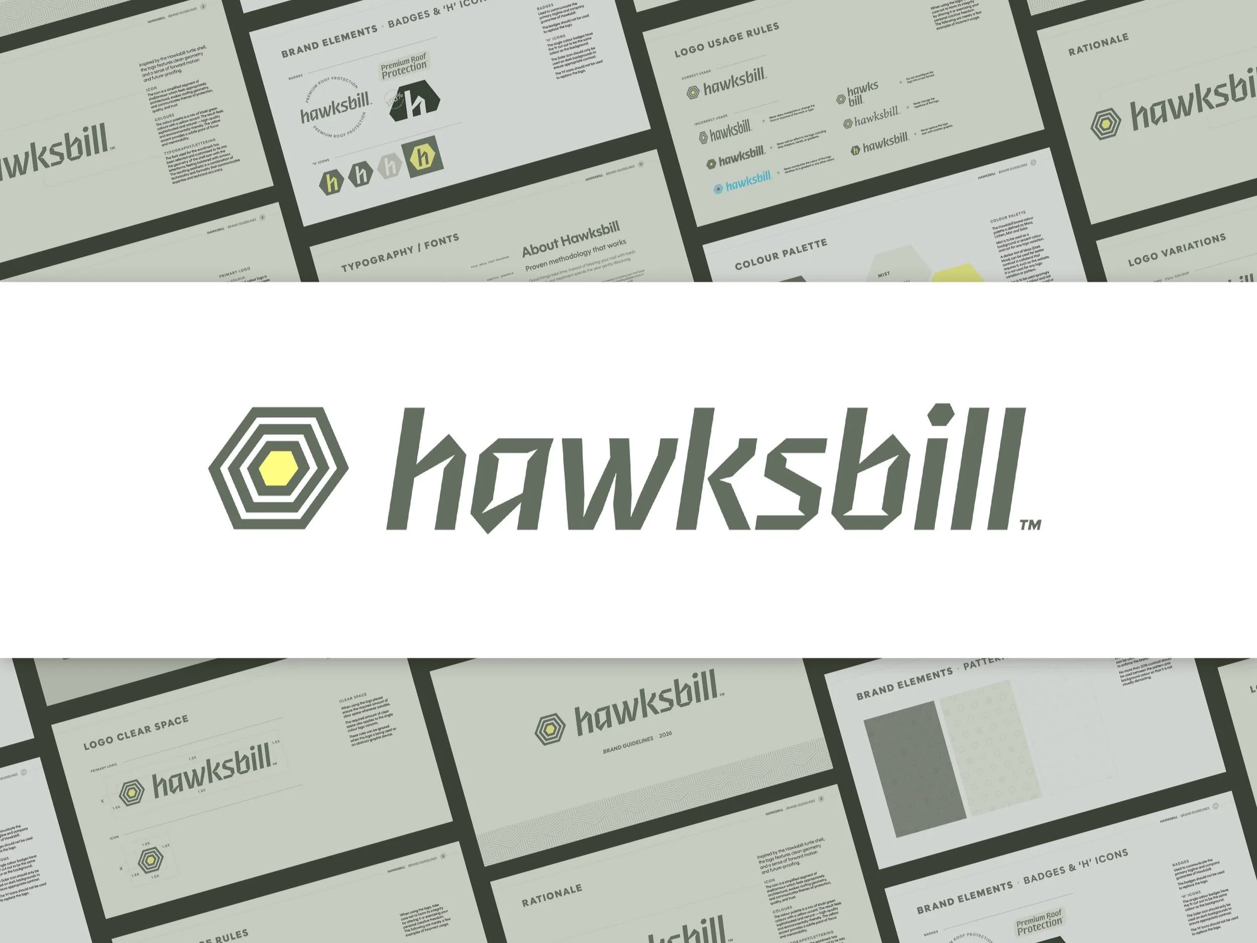
When a local roofer approached us to help launch a new roof cleaning company, we jumped at the opportunity to create something from scratch, including the name. The end result is Hawksbill: a brand designed to feel established from day one.
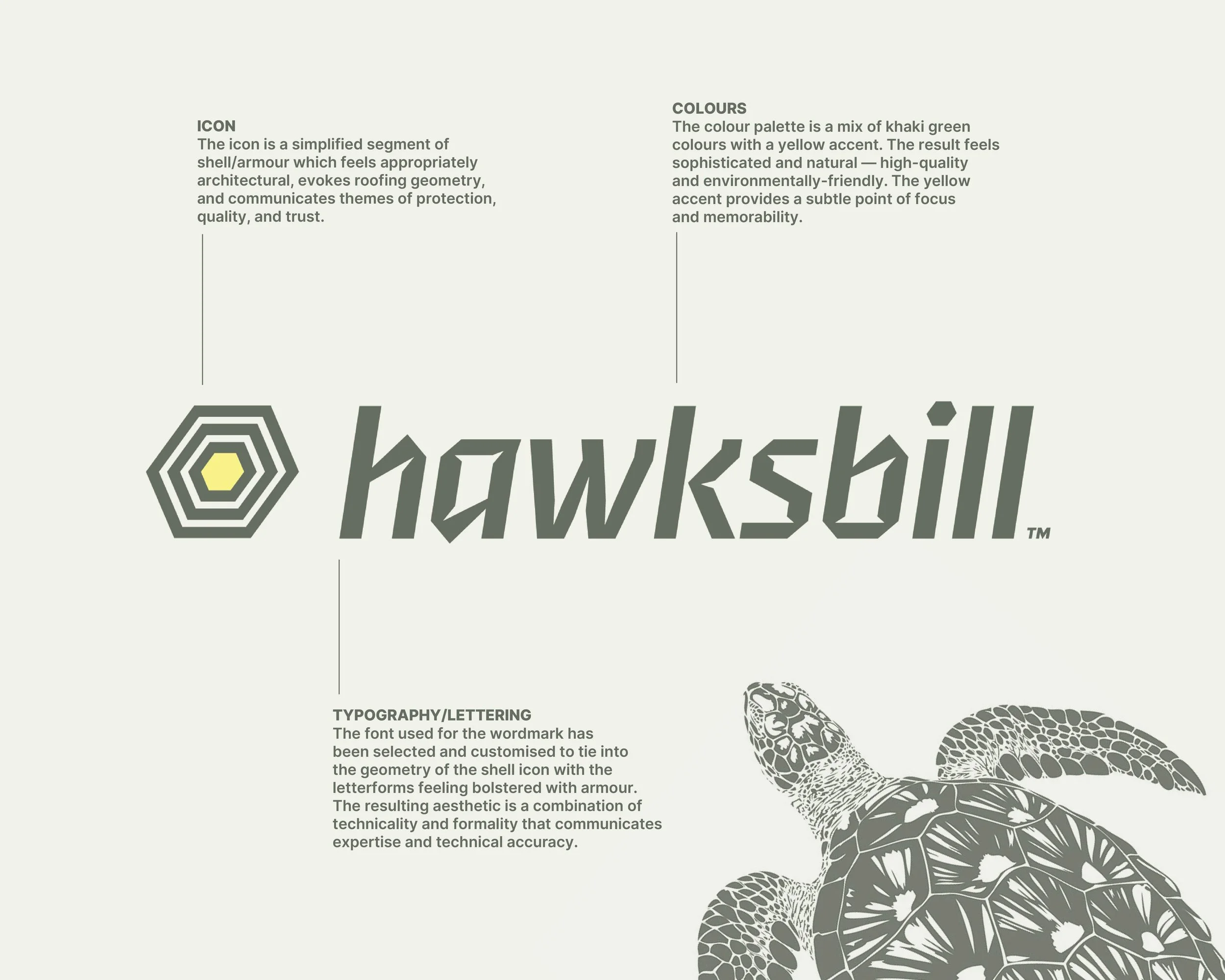
The name came first. Hawksbill draws from the Hawksbill turtle which is a species known for its protective shell and longevity. That metaphor is perfect for a brand that delivers durable, reliable protection for the life of a home. This positions the brand as a long-term partner in roof protection.
From there, the brand and visual identity were designed to reinforce this. The visual language is grounded in geometry taken from the turtle shell. Structured, repeatable, and inherently architectural. The primary icon abstracts this into a hexagonal form that reads as both armour and roofing structure.
Typography follows the same path, with customised letterforms that echo the geometry of the icon, giving the wordmark a technical and engineered feel. The lettering is intentionally formal enough to signal expertise, but softened through forward motion and lowercase styling to remain approachable.
The colour palette does a similar job. Khaki greens establish a natural, grounded base, while a sharp yellow accent aids visibility and memorability.
See more of our branding projects
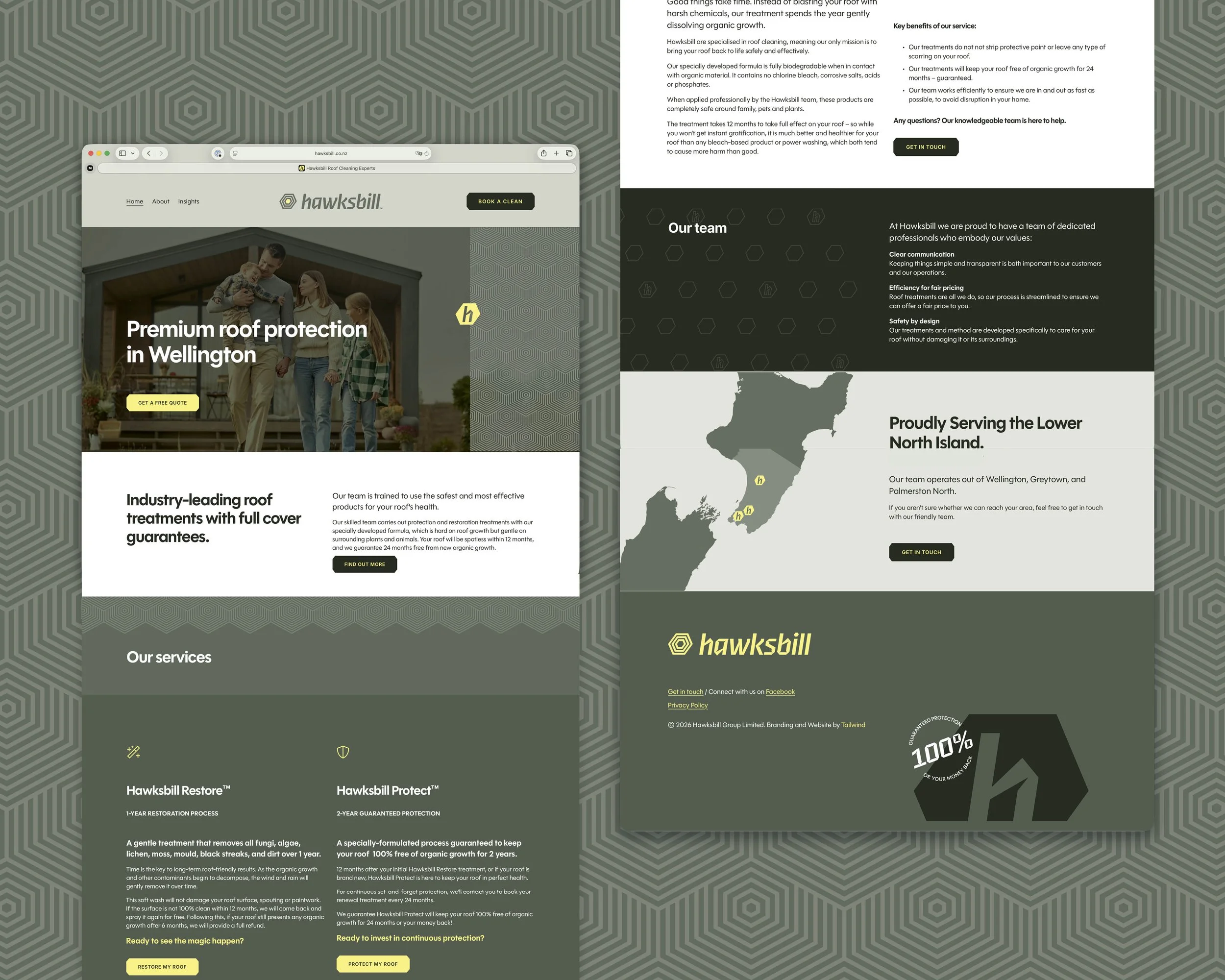
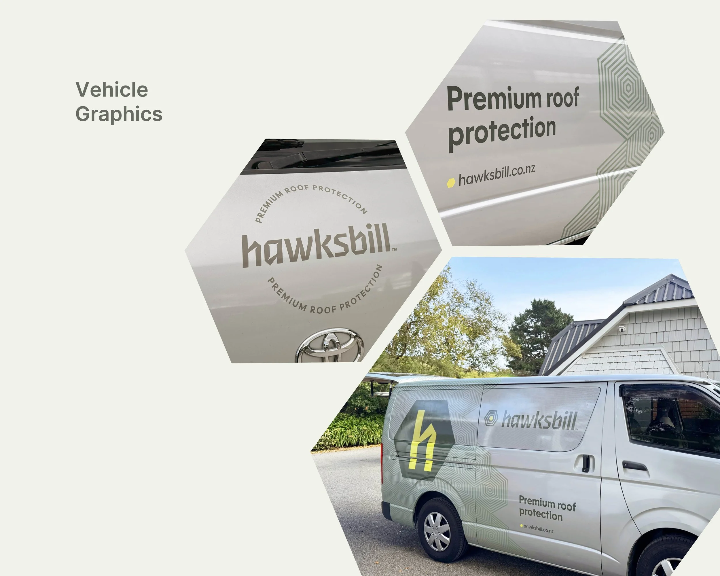
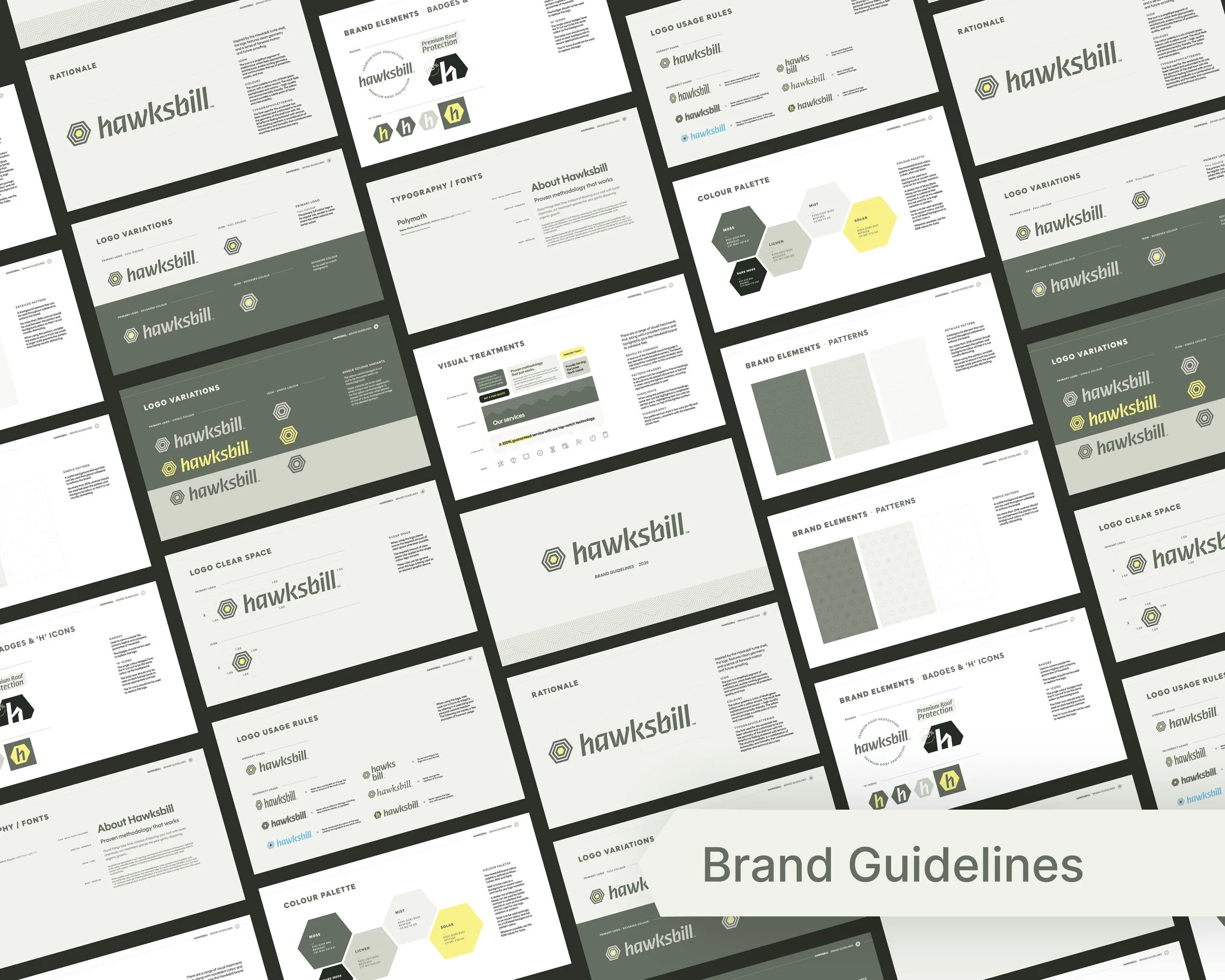
Tailwind delivered a complete process from first discussions about the existing market and new business model, through the naming process, brand identity design. Followed by setup and application across a new website (complete with refined language and process visuals), Google Business Profile, and vehicle graphics.
Talk to us today about your business idea! The earlier we can apply strategic design-led thinking, the better the end result and the stronger the tailwind. We'd love to hear from you.