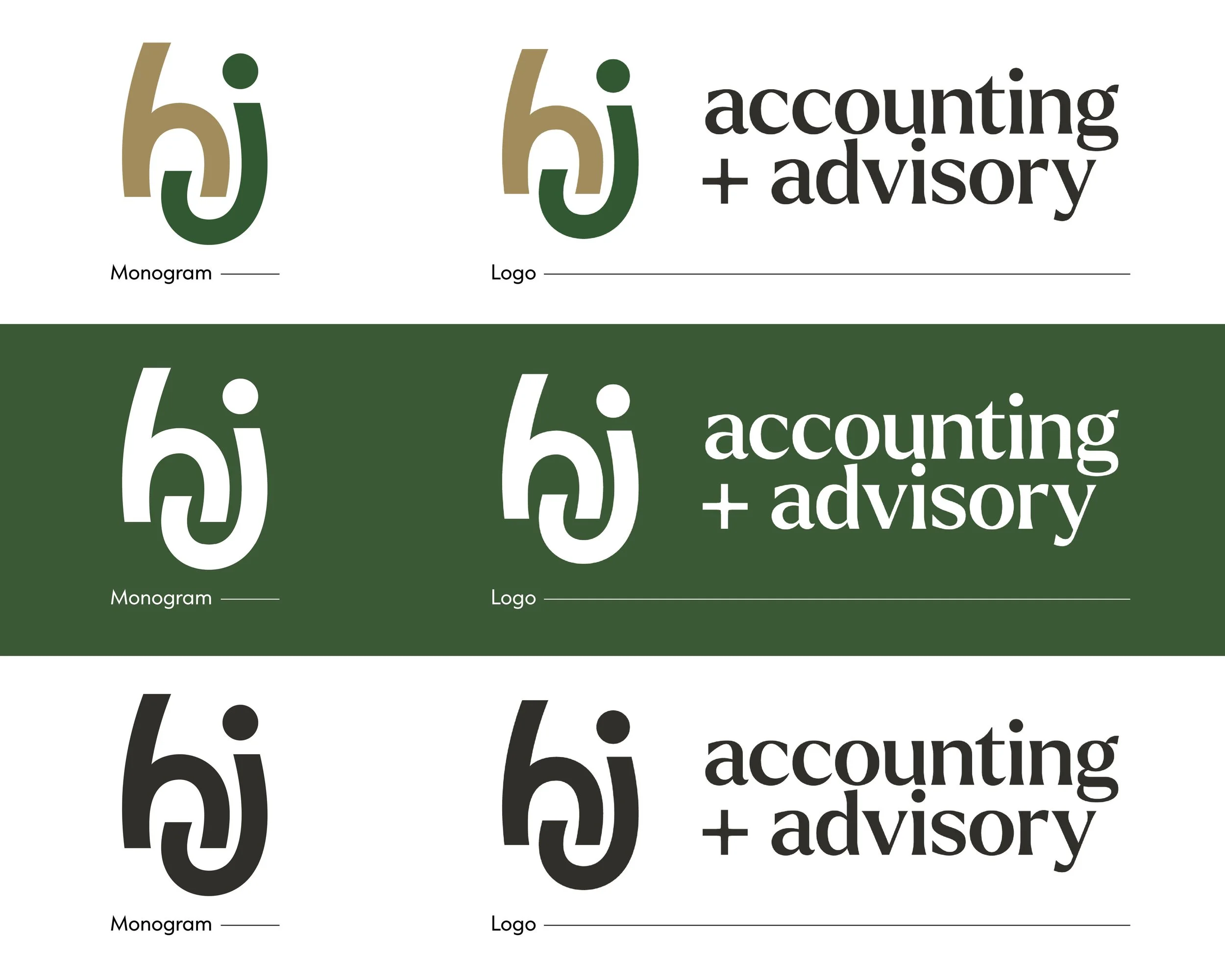
HJ Accounting + Advisory — a fresh brand for a fresh direction.
Hetherington Johnston Chartered Accountants started in 1989 and is a highly-regarded local accountancy firm. In 2019, new owners Helen and Alistair McEwen took over the business. In 2026 they decided they needed to refresh the brand to reflect where the company is at and where it is headed.
Renaming Process
The first thing we established was that the company needed to not only refresh the branding, but also adjust the name.
Already known as "HJ" by customers, Hetherington Johnston Chartered Accountants also had the fantastically-short domain name www.hj.co.nz. So the direction for renaming was clear: we officially shortened the primary name to “HJ”.
We then focused on changing the descriptor to better fit what we learned about the business. Over the years, HJ has focused more and more on providing business advisory services and seminars as well as accounting. The final name, "HJ Accounting + Advisory" reflects this perfectly and is nice and simple. The ‘+’ wasn’t random, either. It’s a small connecting device that brings together what HJ does best and feels appropriate for an accounting firm.

Brand Criteria
The cornerstone of a brand project is to establish the brand criteria. Following interviews and questionnaires we established that Hetherington Johnston exists to help other businesses achieve their goals with proactive guidance, practical support, and trusted financial expertise. They work alongside their clients to train, support, and empower them to grow and move forward with confidence. As a highly skilled, qualified, and accredited accountancy firm with a strong history of supporting local businesses, they combine professional excellence with a genuinely friendly and approachable attitude.
This mix of experience and support shaped the way we defined the brand criteria:
Optimistic and aspirational
Proactive support
Caring, credible and knowledgeable
Trustworthy, community-focused and welcoming
Bright, warm and soft
Research & Learnings
Competitor research showed us that the branding of most local competitors wasn’t particularly strong. Several had new websites, but without addressing the branding the overall presentation wasn’t as strong as it could be. This presented a great opportunity to set HJ as the sharpest and freshest accountancy brand in the region.
Here are the key takeaways and learnings from our research:
To differentiate HJ, we needed to avoid:
Reliance on blue, yellow, or red.
Detailed taglines adding complexity to logo.
Too much spacing in lettering, lacking presence and harming legibility at small sizes.
Harsh black background colour. Charcoal grey looks more sophisticated.
Instead, we would consider on creating a brand with:
A strong monogram that meets industry convention but elevates above competitors in execution.
Two or three colours in the logo to differentiate from competitors that mostly have one tint.
Contemporary font choices, as competitors mostly use dated or generic typography.
Concepts

Concept 1
This concept is a more formal interpretation of the previous logo. Gold and green colour palette was a client request, but works well to feel aspirational and scholarly. The monogram design is restrained and stately to present brand criteria themes of credibility, trust, and aspiration. The concept uses a font called ‘Borna’ which has a contemporary, geometric style.
Concept 2
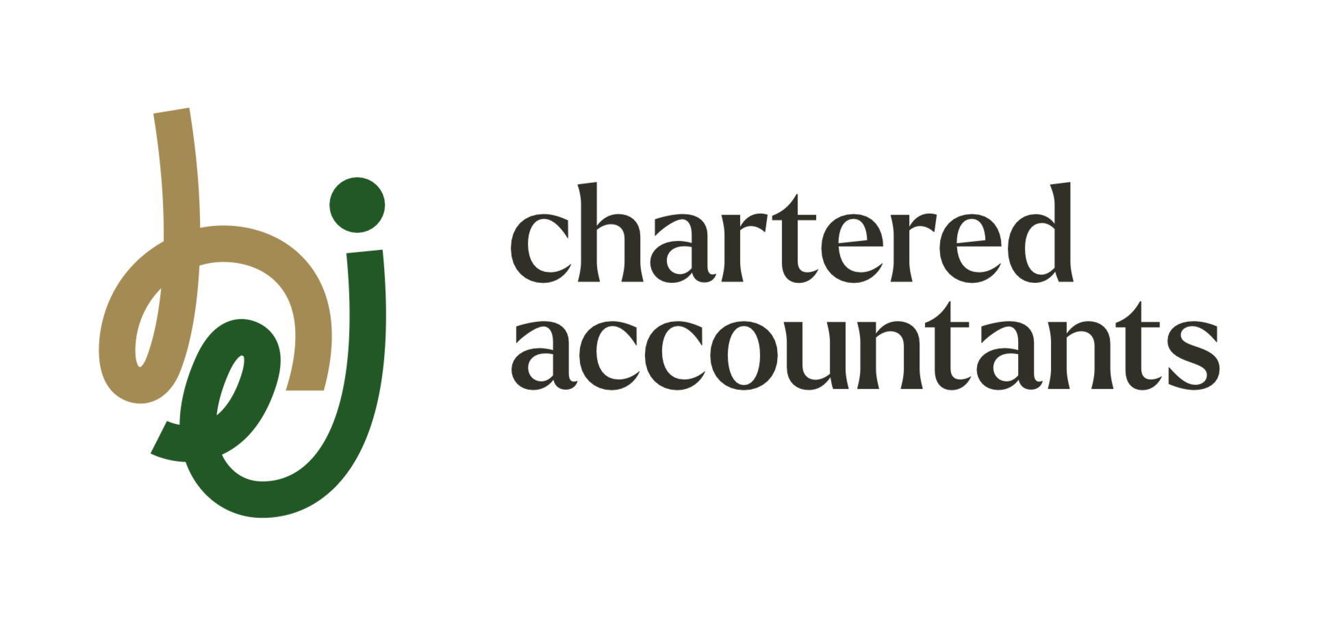
This concept has a playful and memorable monogram, balanced out with formal and refined lettering. Inspired by the previous logo, the interlocking monogram communicates the idea of HJ’s care and partnership with clients. The same gold and green colour palette was used as per the client request. We selected a font called ‘Larken’ which has a formal, chiselled style that feels equally traditional and modern. Lowercase form is intended to pair well with the monogram and keep the brand feeling approachable.
Concept Development
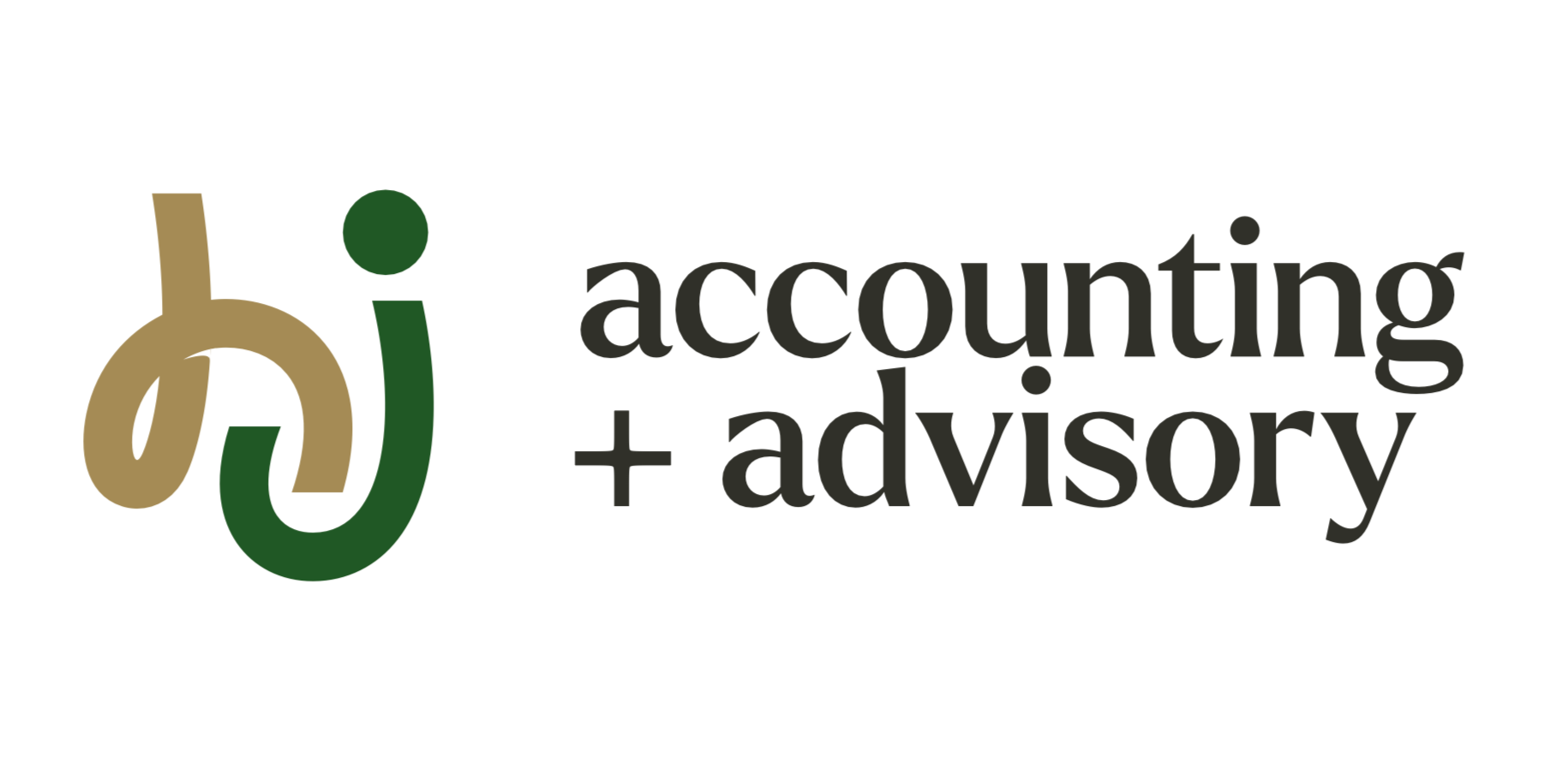
The client preferred Concept 2 so we developed the design based on their feedback to make it less curly and playful, add more weight.

Final brand presentation

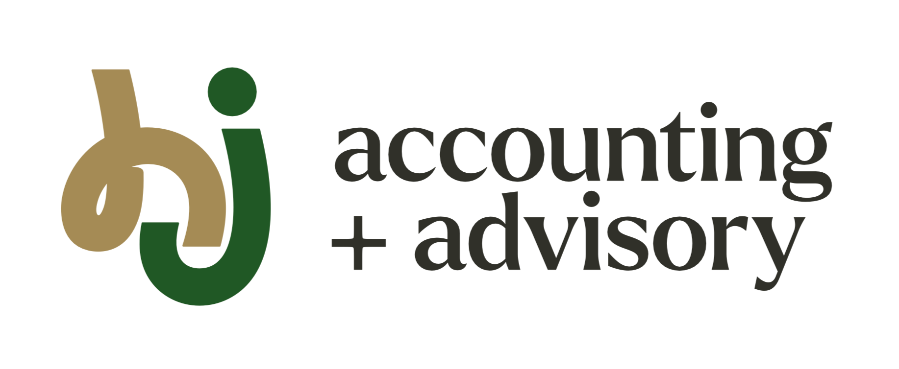
The monogram combines a friendly style with the formal and refined lettering to produce a balanced logo.
The interlocking monogram communicates the idea of HJ’s care, partnership and support; working together with clients about more than just numbers.
The colour palette of green and gold has a formal tone to it while still feeling fresh.
The gold furthers the goal of feeling aspirational and scholarly.
The monogram is inspired by the existing logo’s interlocking ‘h’ and ‘i’.
Instead of rounding the terminals (ends of the letter strokes), the forms themselves are rounded and playful. This achieves the goal of welcoming, bright, warm and soft.
The ‘accounting + advisory’ lettering is rendered in a font called Larken. This has a chiselled design feels equal parts traditional and modern. This achieves the goal of feeling aspirational, credible, scholarly. It communicates trustworthiness and mentorship.
It’s lowercase form is intended to pair with the monogram and avoid feeling too formal or unfriendly.
Brand Collateral and Photography

Tailwind took all-new team photos to personalise the website.
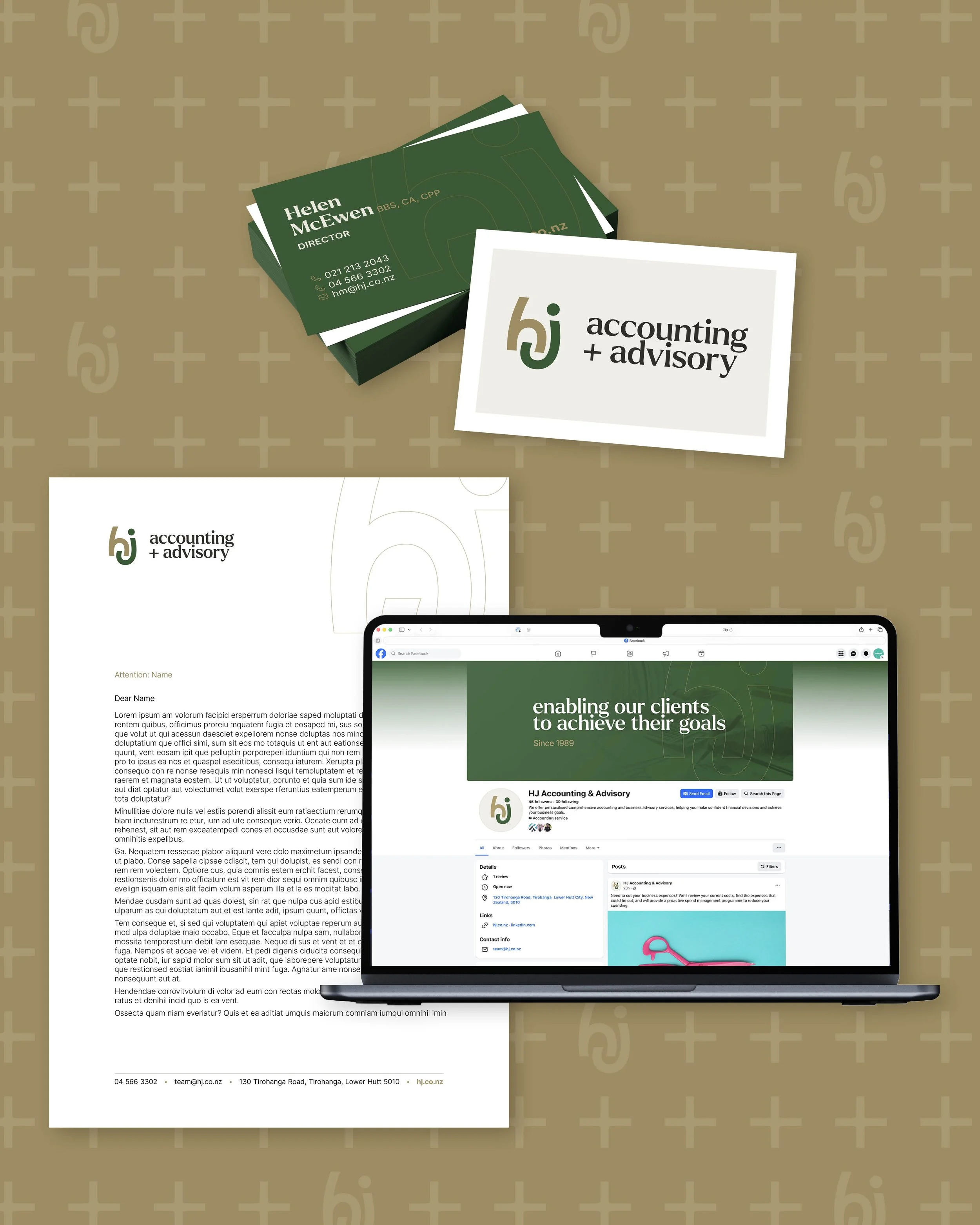
A range of collateral to outwork the refreshed brand in all areas.