Built to Last: Refreshing Insol’s Brand
Insol is New Zealand’s specialist in architectural screening and facades, delivering complex, award-winning and internationally recognised work. As they prepared to expand more overseas, it became clear that their visual identity needed to better reflect the quality and consistency of their work.
Tailwind was engaged to undertake a brand review and subsequent refresh, helping to unify Insol’s visual language and strengthen the presentation of their projects and product offerings.
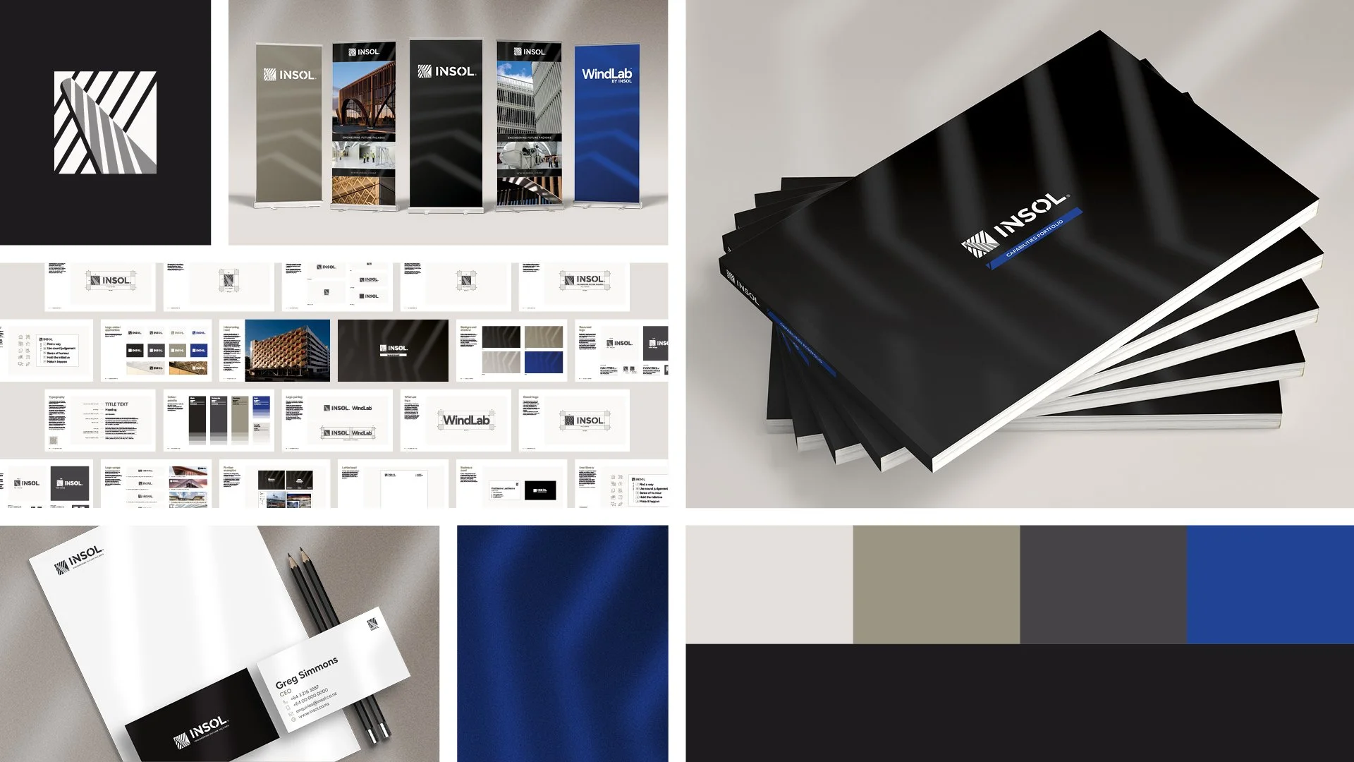
A snapshot of the end result

“Tailwind delivered exactly what we needed – a refreshed brand identity to match the quality of our engineering work, without losing what makes us recognisable after 25 years. That's harder than it looks, and they nailed it. As a specialist in architectural screening and facades operating in New Zealand and internationally, we needed a visual identity that reflected our position at the top of our industry. Tailwind understood the brief and their work sets us up for the next 25 years of success.”
— Insol
Selections from Insol’s previous brand guidelines.
Selections from the brand review document we created for Insol.
Brand Review and Assessment
We began with a strategic review of Insol’s existing brand, assessing how it looked and performed across visual touchpoints, and comparisons with competitors in New Zealand, Australia and the United States. This process allowed us to identify where the visual identity was succeeding, where it was falling short, and how it could be improved without unnecessary disruption.
We documented our findings in a detailed brand review, outlining:
Strengths worth preserving
Pain points affecting usability and visual consistency
Opportunities to simplify and strengthen their logo design
What competitors were doing and their respective strengths and weaknesses
This document created a shared understanding of what the refresh needed to achieve and made sure everyone was on the same page before any work began.
We highlighted areas of improvement for the existing Insol logo, including inconsistent geometry, problems with a colour reversed icon, and identifying unnecessary elements.
Our assessment found the current brand presents as reasonably modern, clear, sharp and fairly consistent in application. We found several opportunities for improvement, including:
Simplifying the icon so that it works at small sizes and in both single-colour and reversed schemes
Deploy a new brand font for overall typesetting that is more modern with a sophisticated, technical feel
Develop a cohesive visual identity
Collateral that makes great use of the above.
Refining the Logo
Insol decided to refine their existing icon, aiming for subtle evolution rather than radical reinvention. We sketched, brainstormed and worked on various solutions before presenting their team with five choices:
Keeping the original icon design but correcting visual errors
Updating the icon’s geometry with more even spacing of the bands and adjusting the top-left corner
Updated geometry and corner design, with wider spacing for better reproduction at small sizes
Reflecting the revised wider design so the stripes are in alignment with the Insol wordmark
Dramatically wider spacing for even better reproduction at various scales.
The team opted for option 3 (updated geometry, corner design and wider spacing) for the final logo.
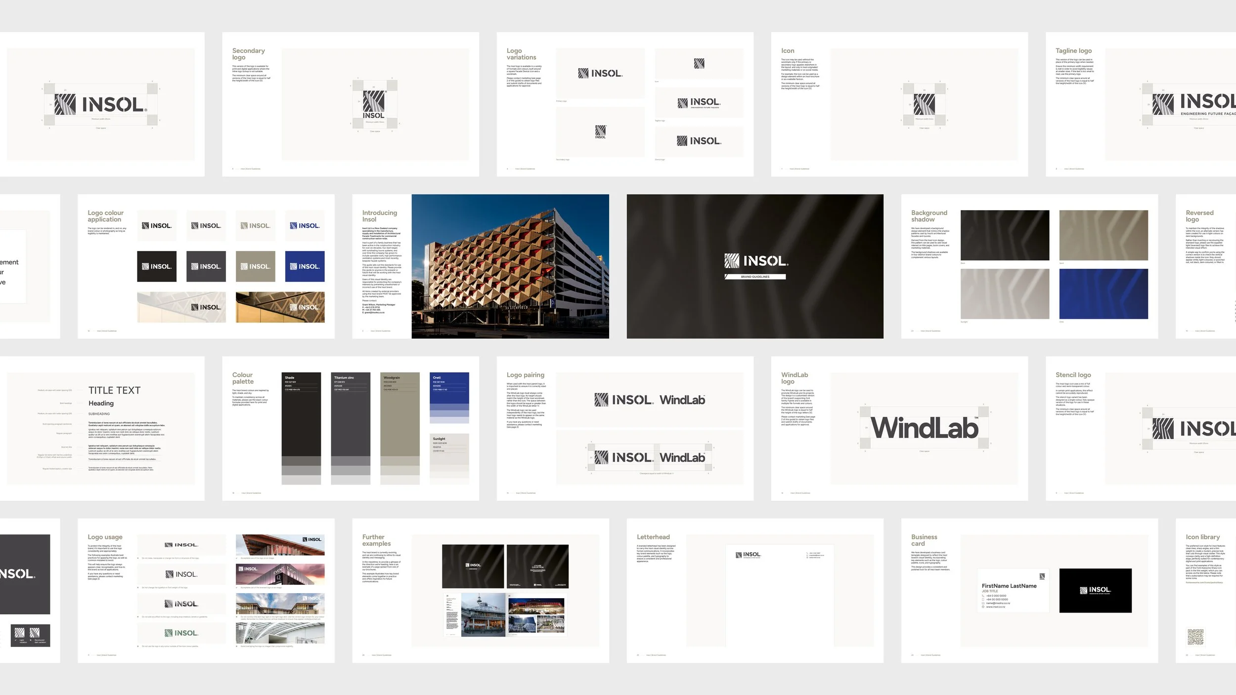
We worked on refining Insol’s variety of logos and designed new versions to accommodate their various application needs. As well as the standards (logo and wordmark version, stacked version and solo icon) we also refined their tagline logo by removing the extraneous graphic element from the previous version, and created a version for stencils or single-colour applications (bottom left image).
The logo presents a unique challenge with reversed versions. There are many factors at play, including a combination of full colour, semi-transparency and stripes, and a blade with an edge that gets lost in the dark version. We created two versions of the icon (a light and dark version) and supplied instructions on when to use each and how to make sure you have the correct one (note the stripe colours on the blade in each example above: they should always be light).
This video shows the differences between the error-corrected previous icon design and the revised final version. These changes appear subtle at a glance, but this comparison shows how even small changes can have a big impact on the overall look and feel of a design.
We adjusted Insol’s colour palette with minor edits to their existing shades to bring them together more harmoniously as a blend of earth toned light and shadow. The usage of Oreti blue was also decided to be de-emphasised and used only for WindLab-related communications as much as possible.
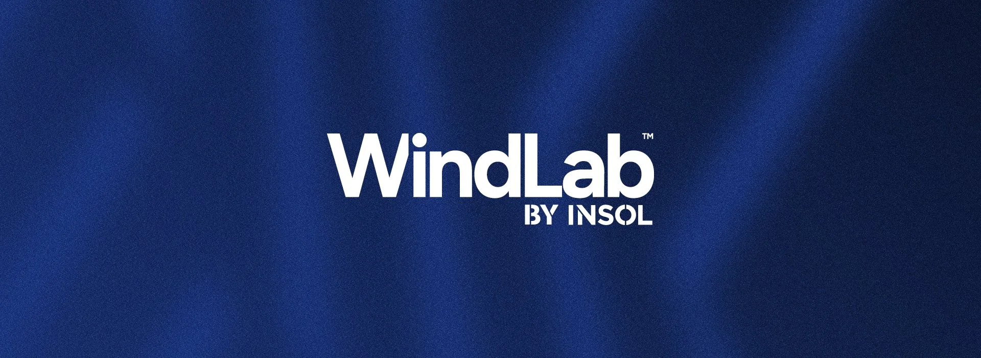
Tailwind designed a new wordmark logo for WindLab™. With the ability to generate a constant wind speed of up to 200 km/h, the WindLab™ Wind Tunnel at the Insol Facade Testing Laboratory is unique in the Southern Hemisphere. The new wordmark was created to be understated, subtle and confident, with character added in the cropping of the W.
Bringing the Brand to Life
While the logo and brand guidelines were being finalised, we expanded into the creation of supporting collateral and design work across various touchpoints. This was an exciting opportunity to create a cohesive look and style for Insol that wouldn’t distract from the incredible engineering work and its photography.
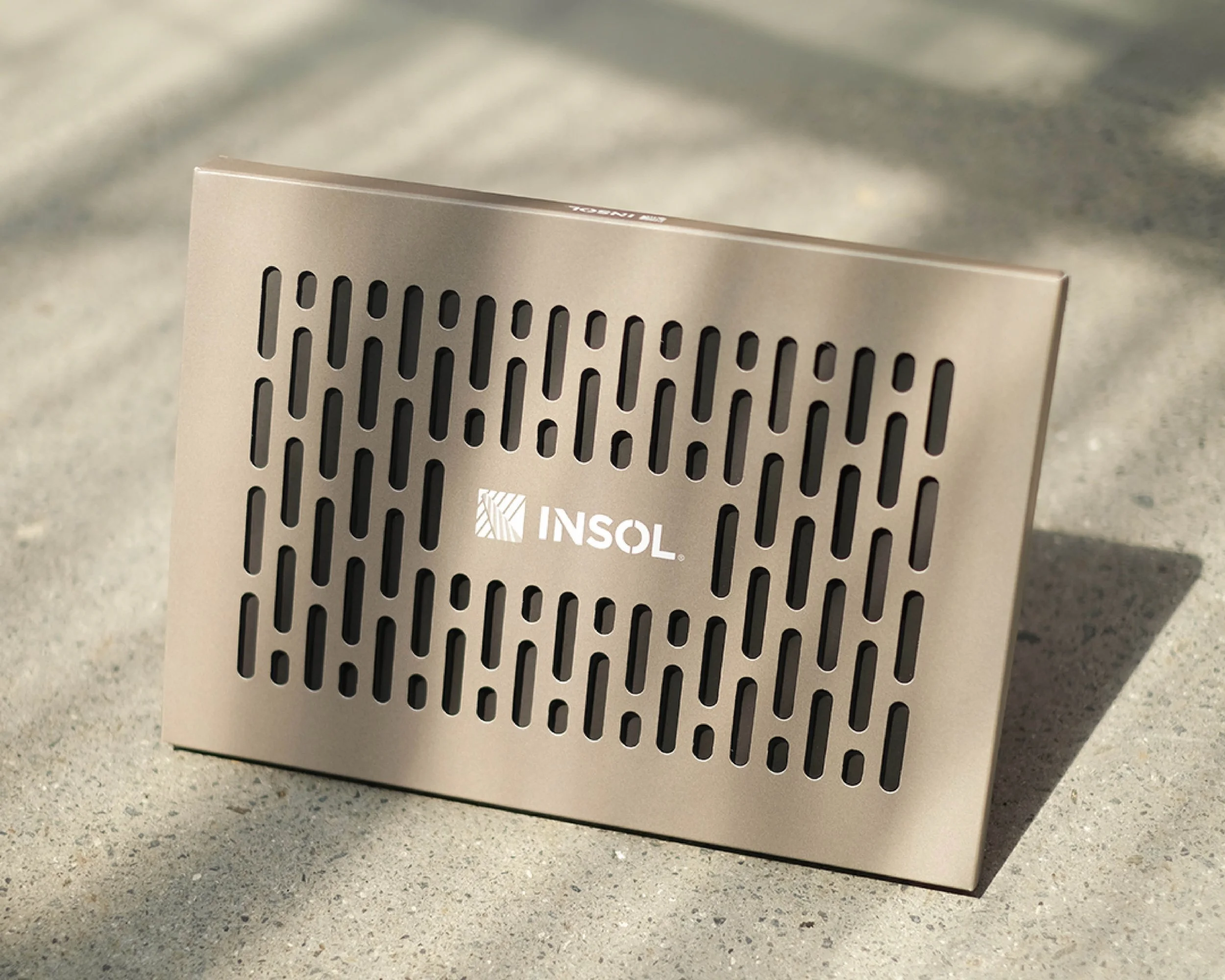
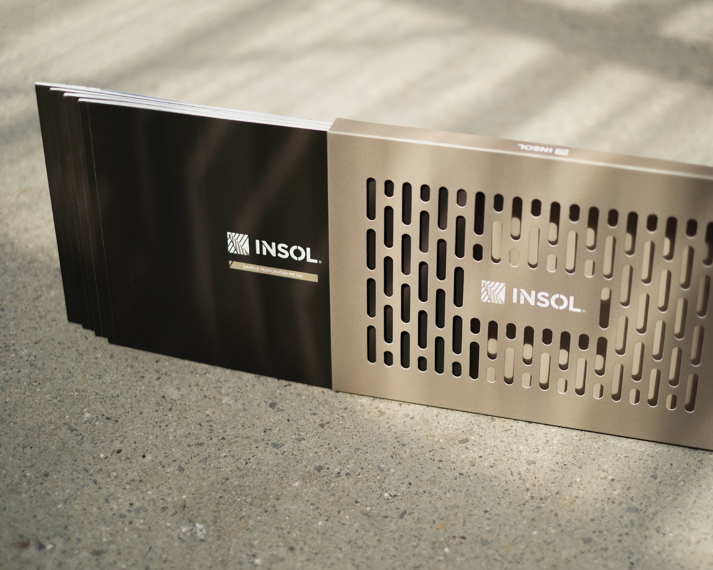
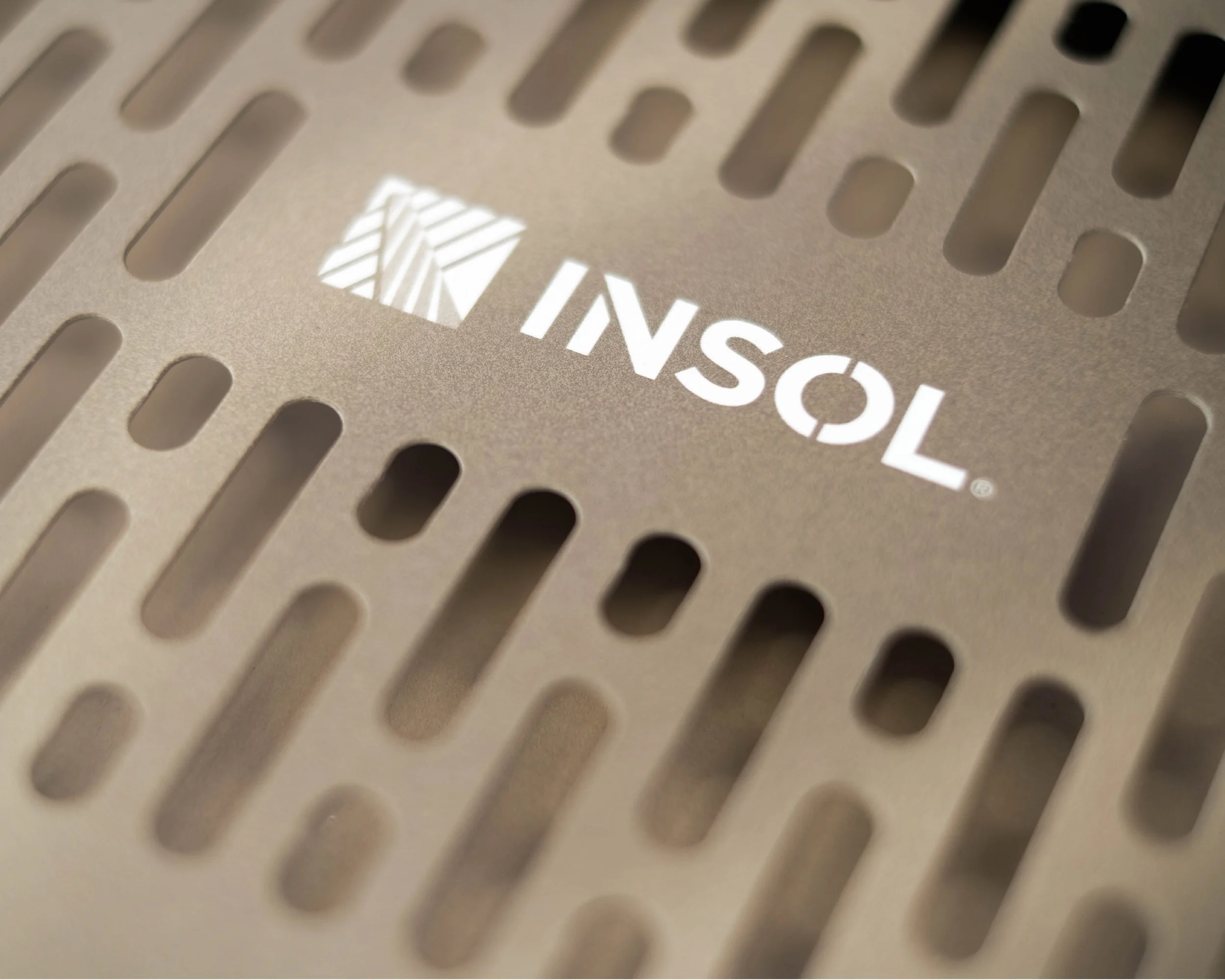
Background textures were created based on the concept of light and shadow, using the logo icon as the shadow shape, with noise and grain and gradient colour creating depth and contrast with photography and text. The textures were finalised and used across books, brochures and pull-up banners.
Letterheads and business cards were created in the new visual style, eschewing multiple colours and design elements and aiming for simplicity and minimalism.
For proposals and RFPs, we created a suite of customisable templates the team at Insol could use within Canva.
We designed a suite of pull-up banners for use at shows and events.
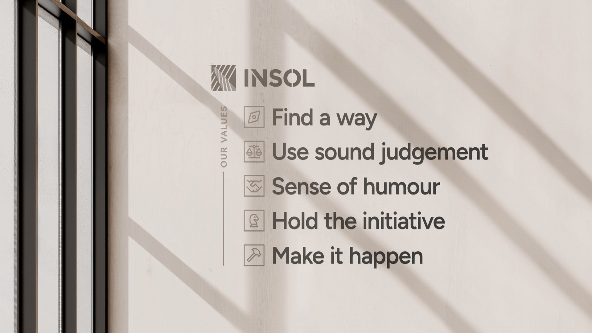
Insol’s company values were designed as a set of printed decals for their office wall.
Publications
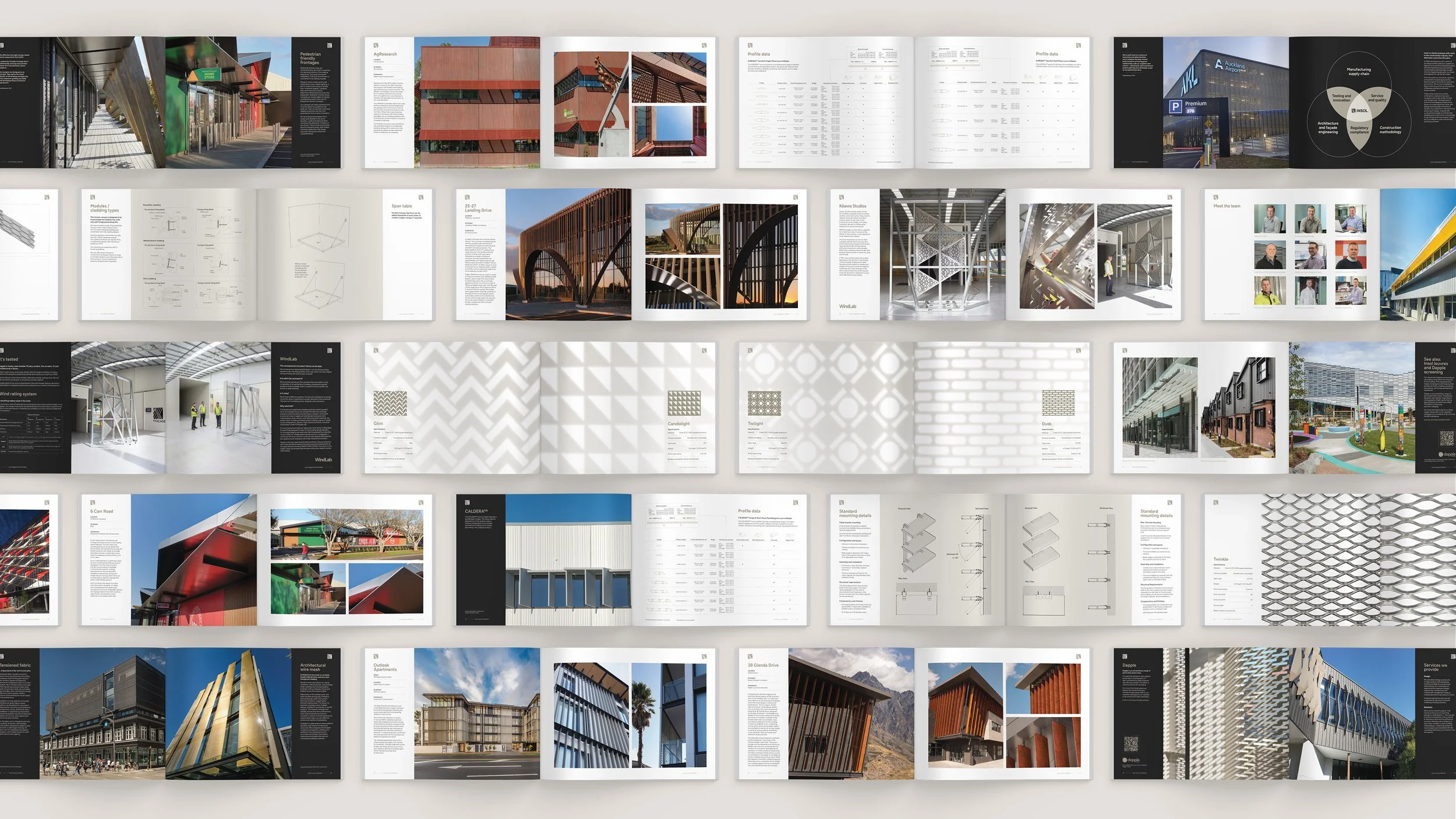
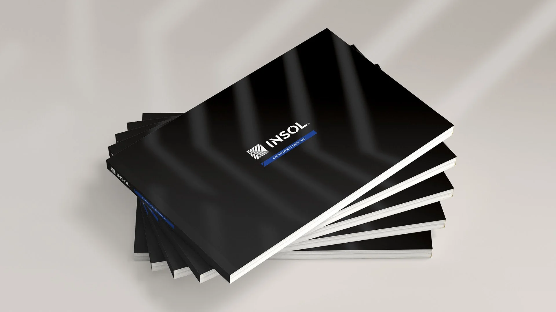
A key part of the rollout was the design and production of four publications, all delivered at the same time: Canopy (32 pages), Capabilities (48 pages), Dapple (56 pages) and Louvre (56 pages). Each book was designed as part of a cohesive family and finished with a spot UV gloss cover. The scale and complexity of producing them in parallel with the brand refresh made this a unique and demanding piece of work, and one we’re particularly proud of.
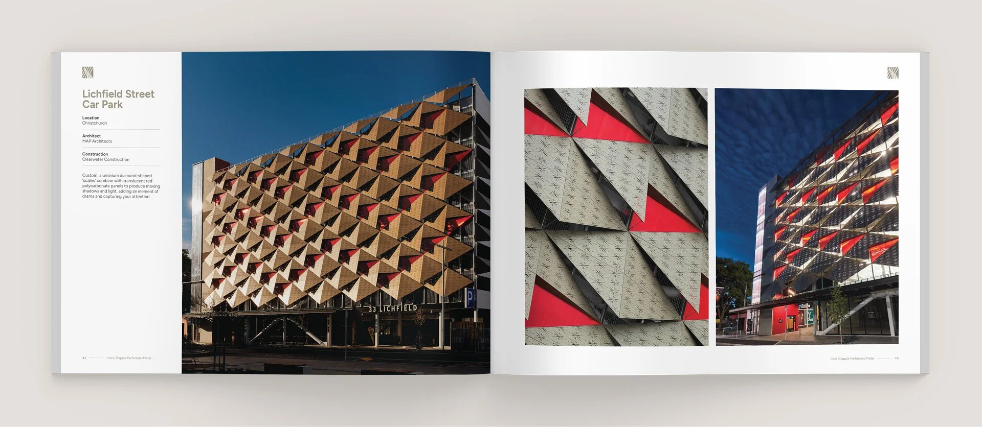
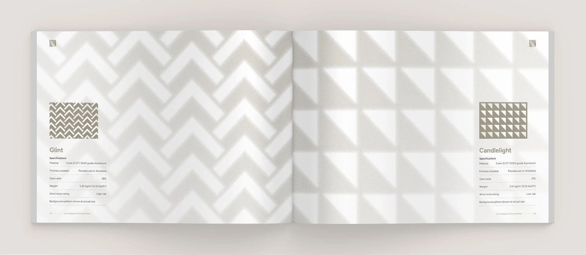
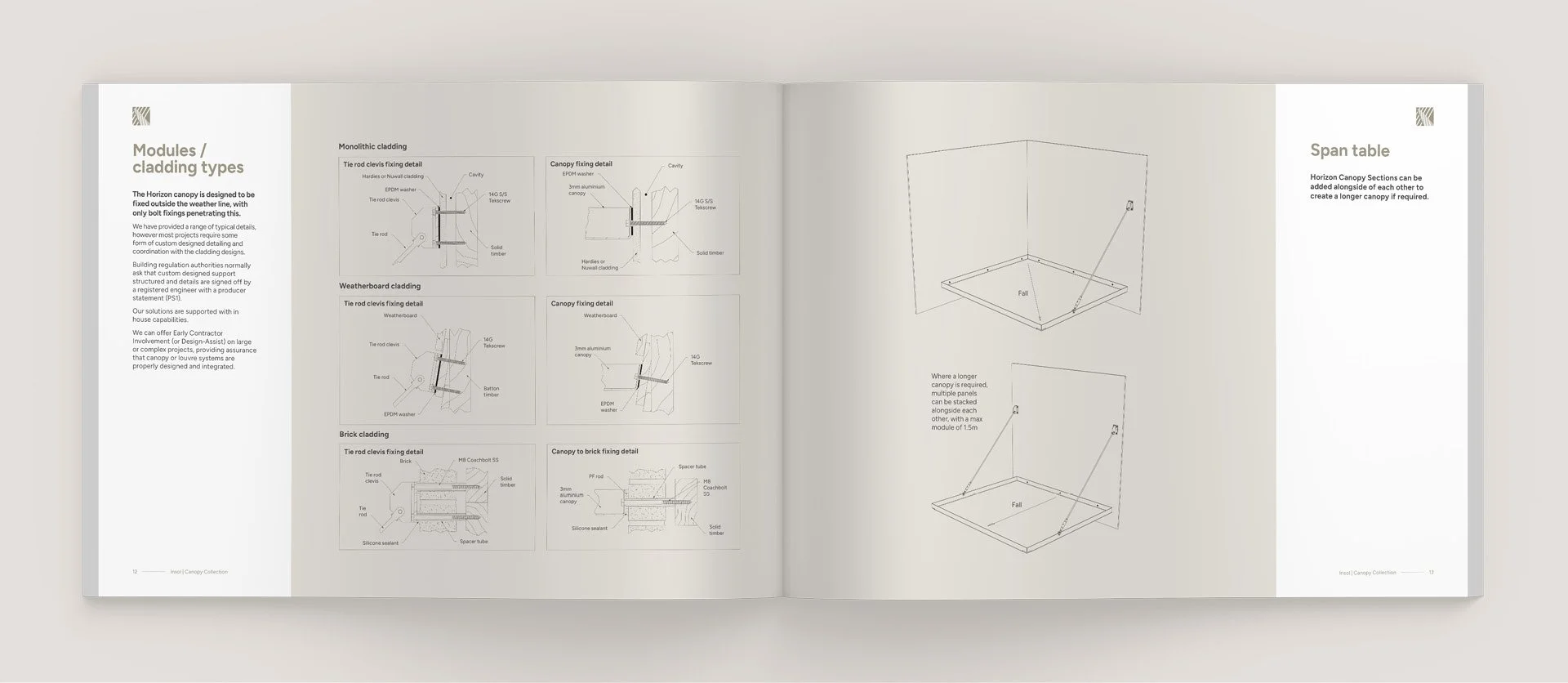
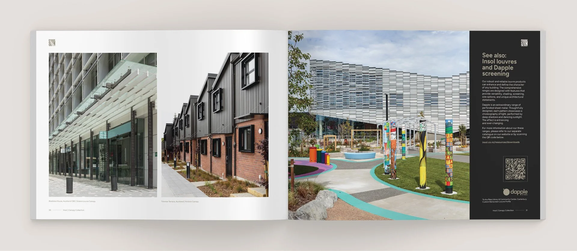
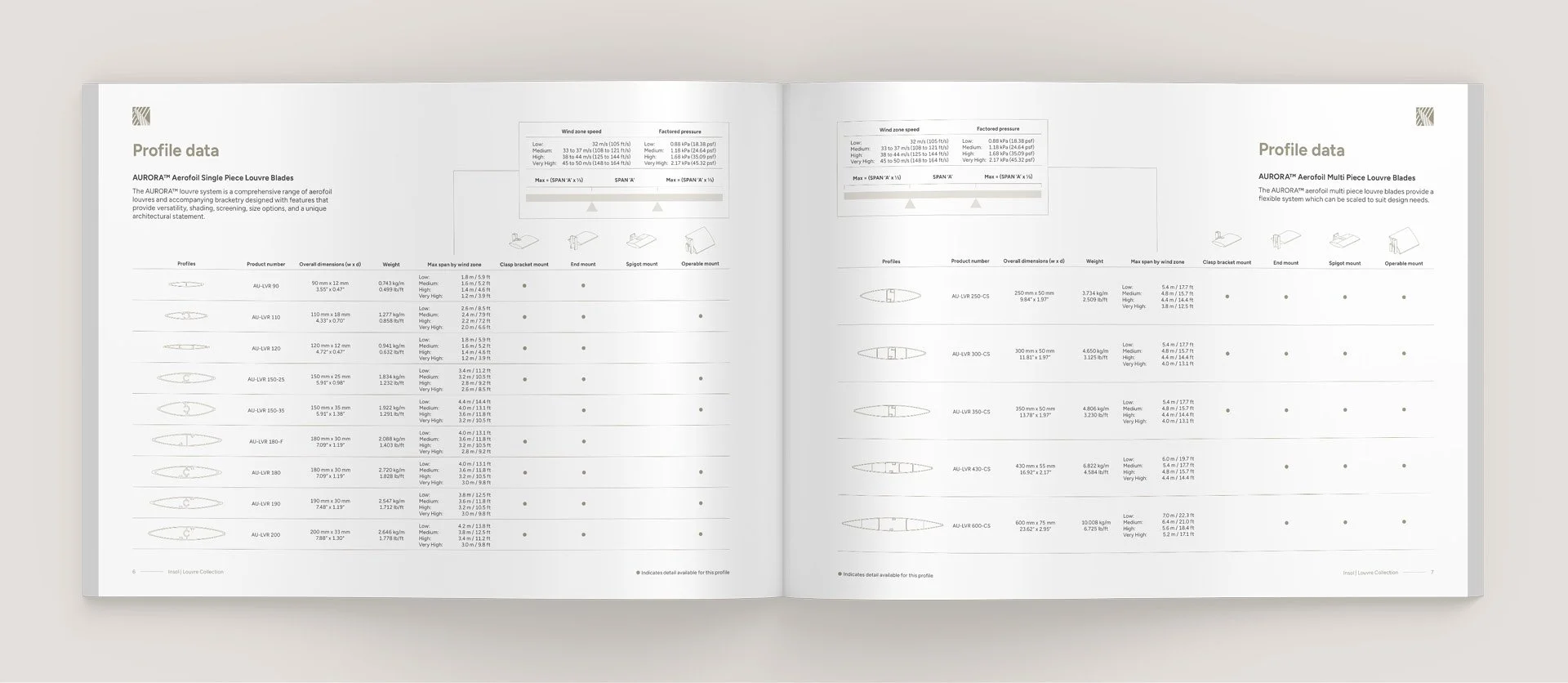
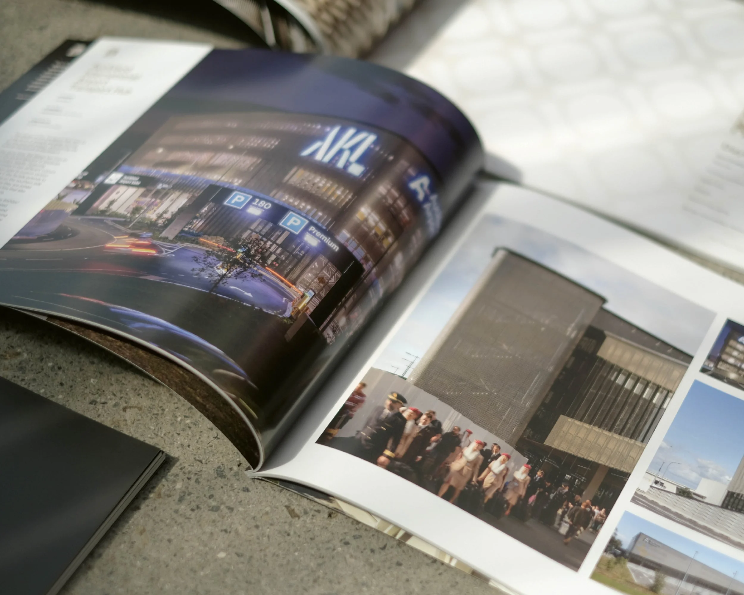
The collection of four brochures showcases product lines, case studies, technical information, and incredible architectural photography.
This helped us define and unify Insol’s new visual identity. Each book was perfect bound and the set was completed with a custom die-cut slipcover design based on Insol’s Dapple product “Dusk”, with a subtle illustration of shadows cast across the cover.