A fresh brand for Griffiths from the ground up — and down
Griffiths partnered with Tailwind to undertake a strategic rebranding to mark a new chapter for the company, streamlining its operations and presenting a cohesive identity to the market.
Since it was established in 1971, Griffiths Drilling has been a stalwart of the industry and the Wellington Region. Griffiths has built a strong reputation for geotechnical expertise and innovative drilling solutions. Griffiths Civil Build emerged from Griffiths Drilling in 2010 and has rapidly grown as a trusted partner in civil construction projects.
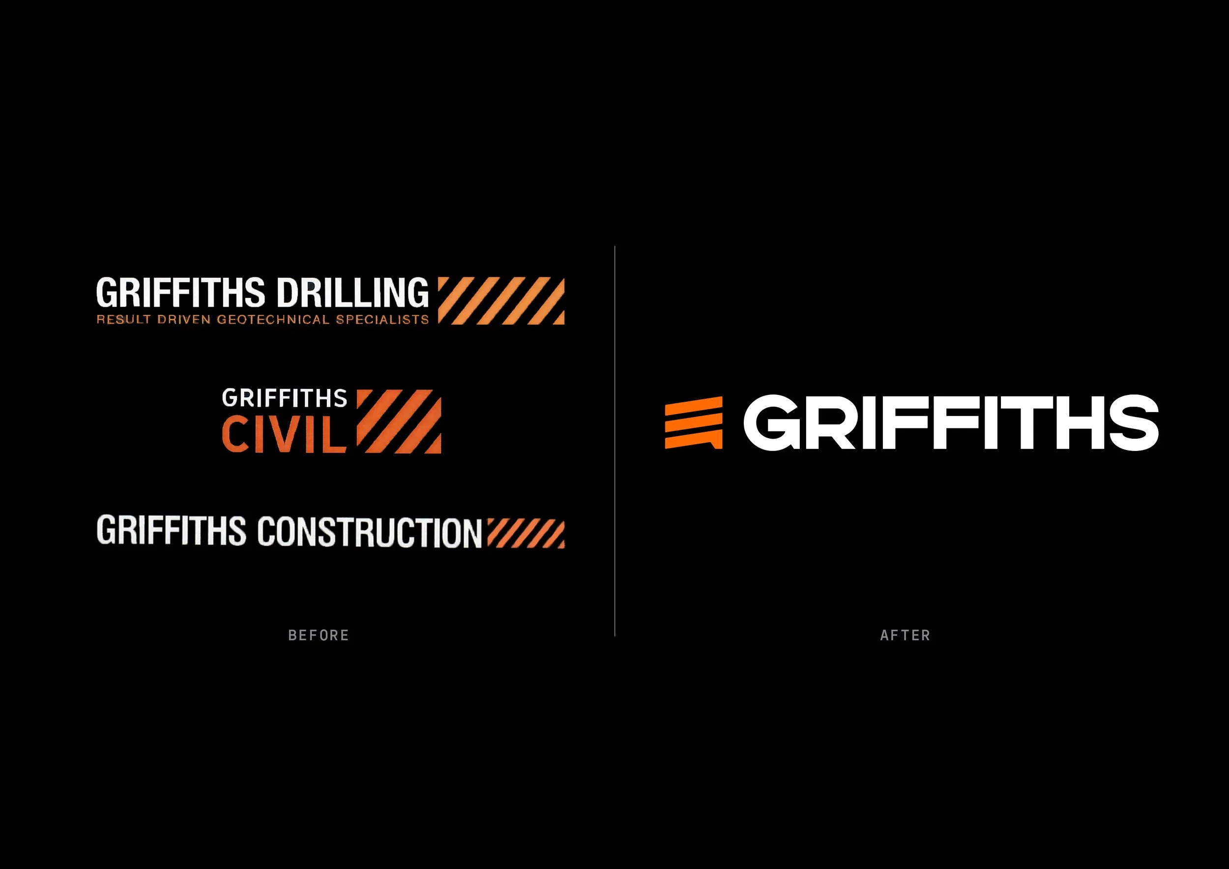
The move to a single "Griffiths" brand reflects the synergy between the two divisions and aims to simplify client engagement, leveraging the combined strengths and decades of experience across both drilling and civil works. This evolution positions Griffiths as a comprehensive solutions provider for a wide range of construction needs across New Zealand.
THE BRAND RATIONALE
This is a brand that retains the strengths of the previous design and brings it forward into 2025 and beyond. It’s a clear evolution that comprises elements that are flexible to use and can stand alone, to deliver a brand that is iconic and memorable without being overbearing.
Icon: The hazard stripes have a new direction and a new role for the new brand. Three stripes combine to form a new icon that evokes an abstract ‘G’ — its spur echoing the spur on the G in ‘Griffiths’. The new 9° slant has several benefits: it implies downward drilling movement; feels structural and sedimentary; and communicates forwards and upward motion to reflect a company that is always innovating.
Lettering: This font has been selected and modified to strike the perfect balance between retro-inspired form and contemporary sharpness. It feels simultaneously historic and current, human and technical. This presents Griffiths as a family company with a long and proud history that is all about quality and innovation.
Stripes: Derived from the icon, the new hazard stripe pattern is now applied vertically instead of horizontally. This allows for more flexibility when most brand applications are height constrained. The higher density preserves integrity when just a small amount of the pattern is shown. This further enhances flexibility of application and increases the scale differential between pattern and logo for more dynamic impactful layouts.
Colour: The colour is a slightly brighter version of the previous orange. Fresh and modern, vibrant and memorable.
LOGO VARIATIONS
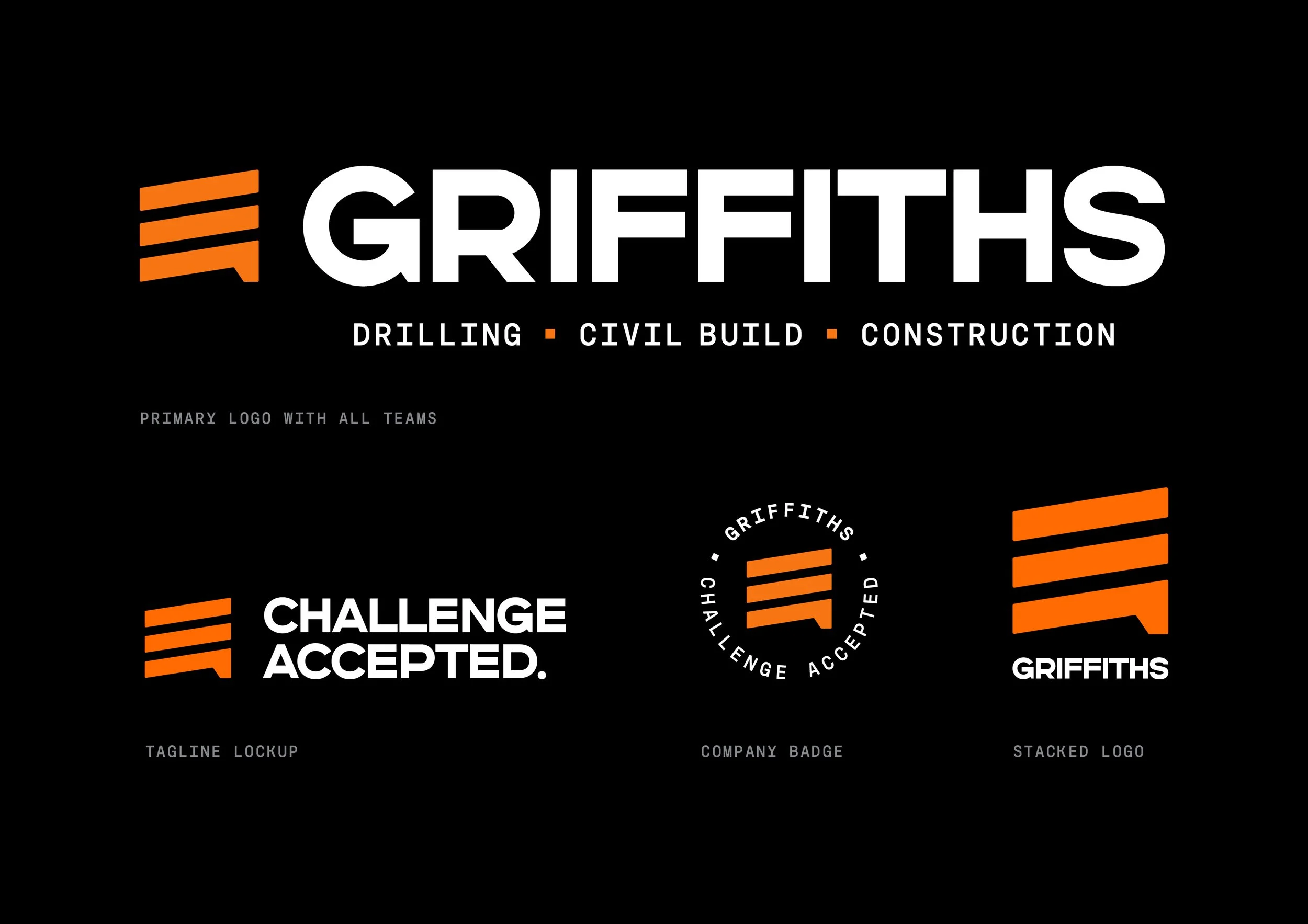
We created a range of logo variations for Griffiths: horizontal and stacked versions of the logo as well as a tagline lockup and a company badge to accompany the primary logos.
LANGUAGE
We worked with copywriter extraordinaire Dan Moth to create some bold new language for Griffiths following a process of re-writing the company brand values.
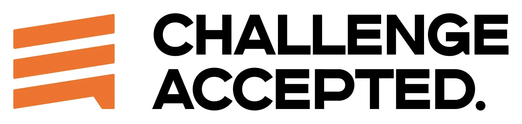
The primary tagline — Challenge Accepted — encapsulates the company’s spirit with a simple powerful statement that:
Captures Gordon Griffith’s original pioneering spirit.
Speaks to the innovation that drives Griffiths today and into the future as more services are added and new technologies embraced.
Describes how the Griffiths team approaches any job, the reassurance this gives to clients and a reason to choose Griffiths for new, ambitious projects.
Is a statement only a proud industry leader can own.
When you hear it, one name comes to mind.
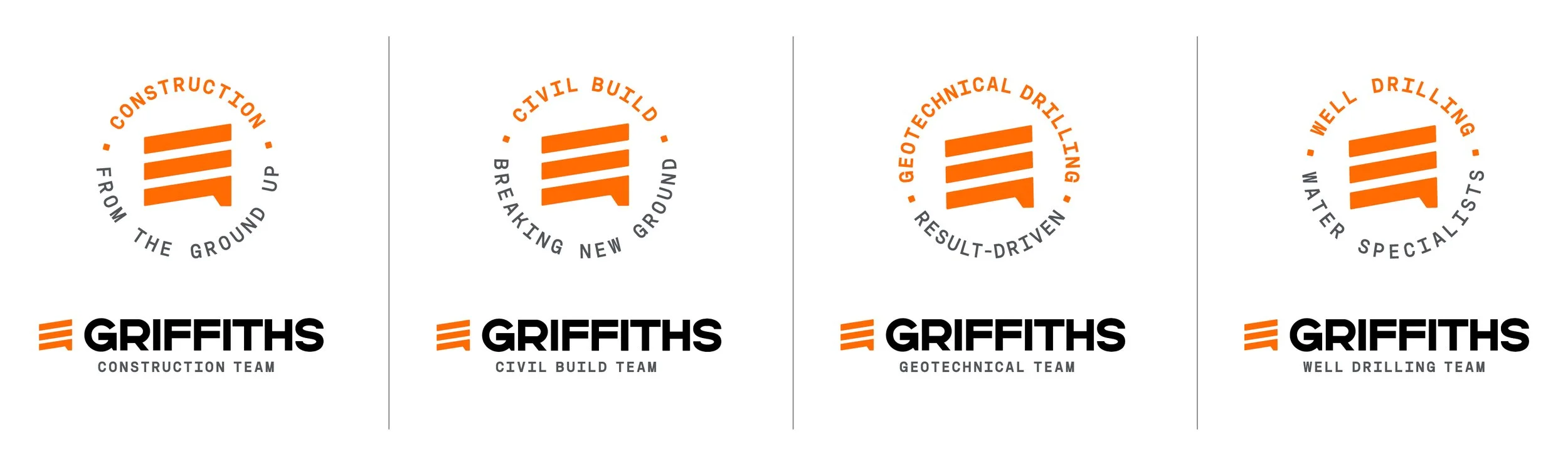
With the divisions of Griffiths aligned behind the one brand, it was necessary to distinguish the various parts of the business in a sensible way. So we created the concept of ‘teams’. This framing works well for a range of reasons:
Instantly gives the sense of a single unit being part of a large group
Implies a sense of specialty and expertise
Doesn’t sound impersonal, like ‘division’
Teams are more collaborative and closely related than divisions, which is exactly how Griffiths works to deliver results
COLOUR & TYPOGRAPHY
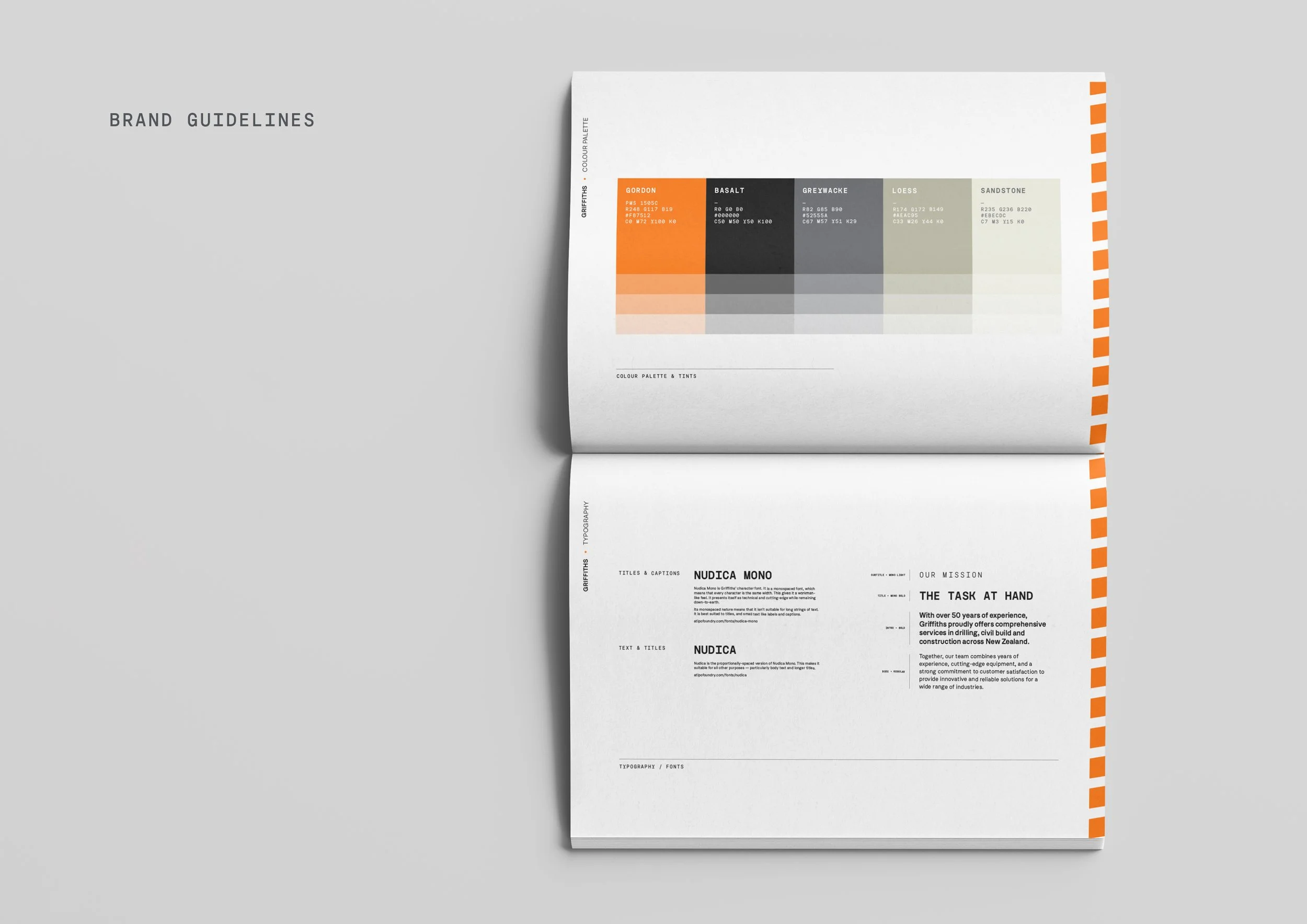
One of the challenges Griffiths faced when we assessed their existing marketing was their limited colour palette of orange and black. So as part of the rebrand we created a wider palette inspired by the aggregates they encounter and use in their work — all complimentary to their key orange (which we named after their founder).
The new typography is built around the Nudica font family. This features a monospaced variation that achieves a perfect blend of attributes for Griffiths: innovative, technical, and workman-like.
SIGNAGE
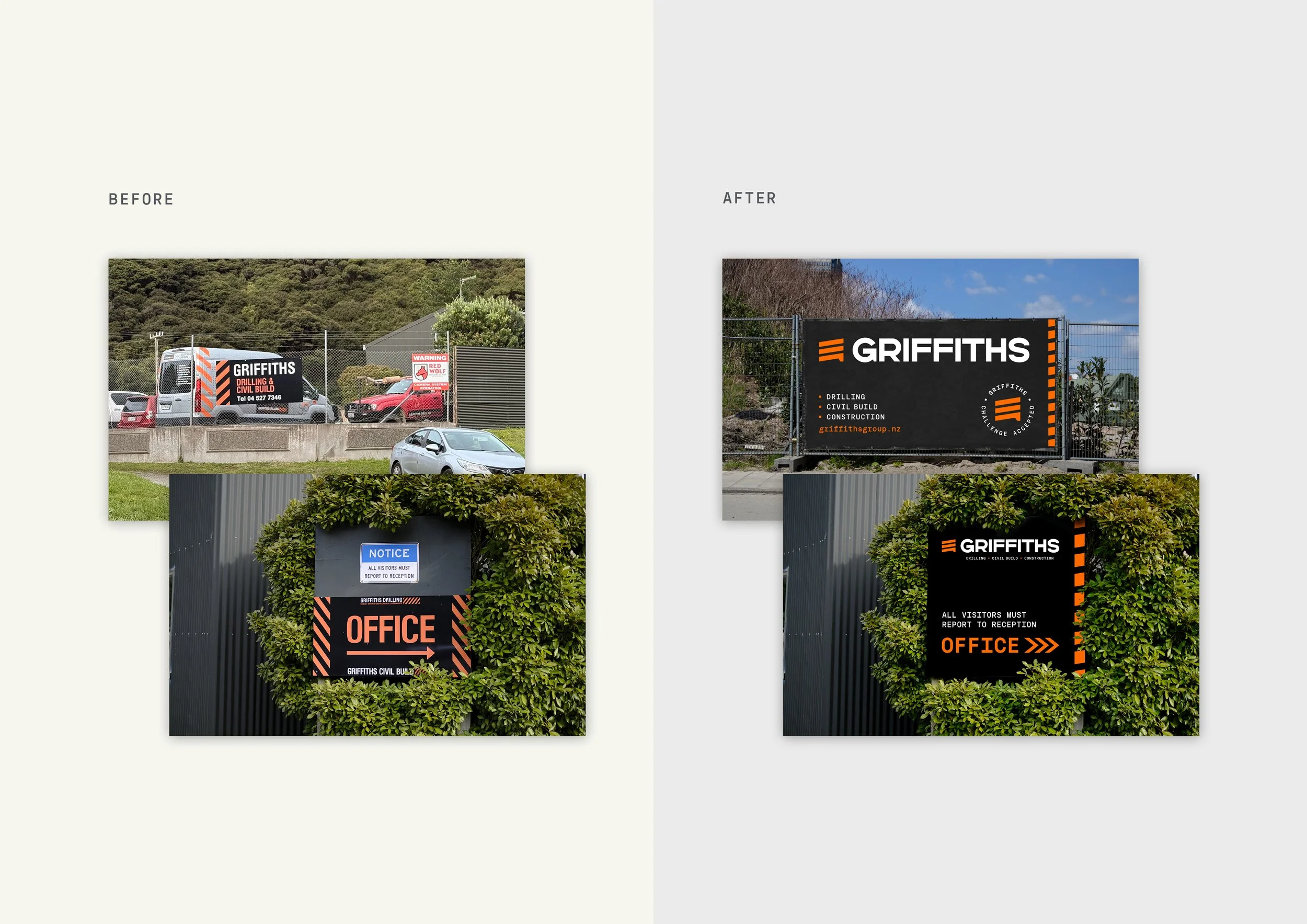
We’ve refreshed some of the signage applications, with more extensive HQ signage still in progress.
WEBSITE
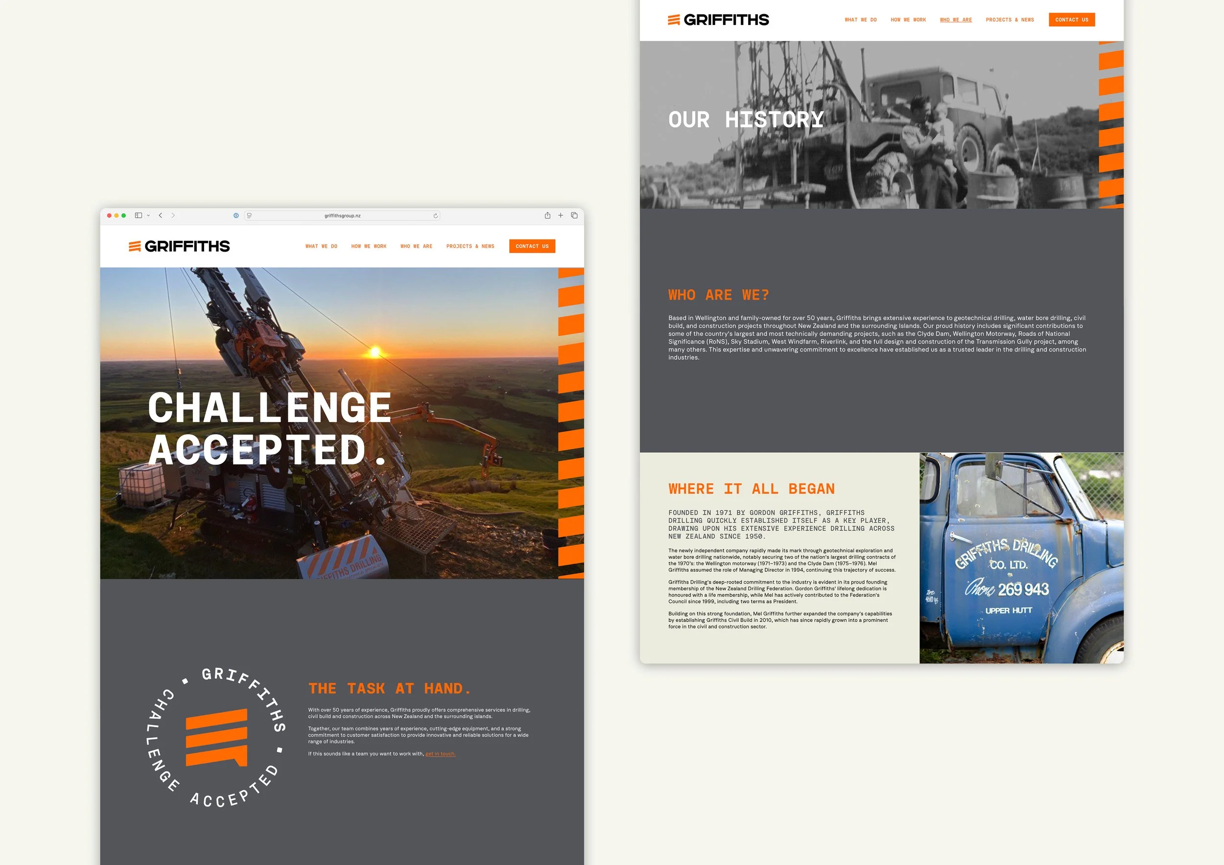
The new Griffiths website is a merging of what was previously separate websites for Griffiths Drilling and Griffiths Construction. It was a fantastic playground for fleshing out the new visual identity. Particular highlights are the animated badges and stripes, modular layouts, and a showcase of the new typography.
DECALS
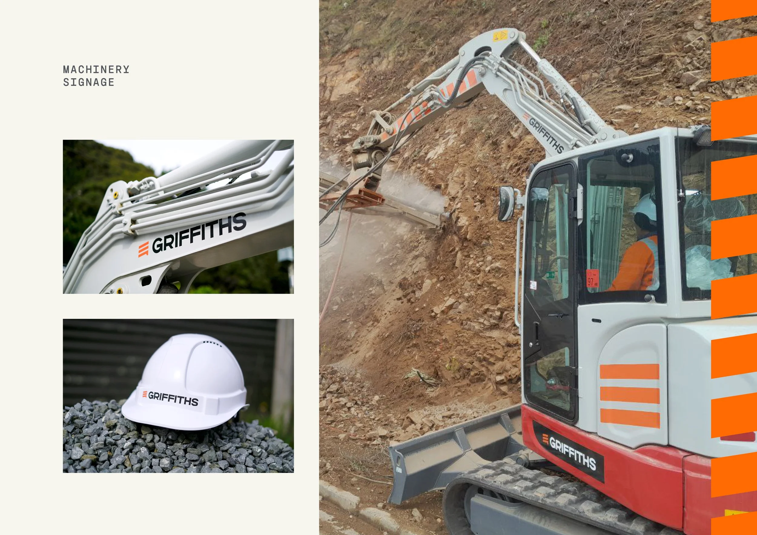
The first applications of the brand in decal form were on the team hard hats and a new digger — the hazard stripes look great on the excavator boom.
MARKETING COLLATERAL
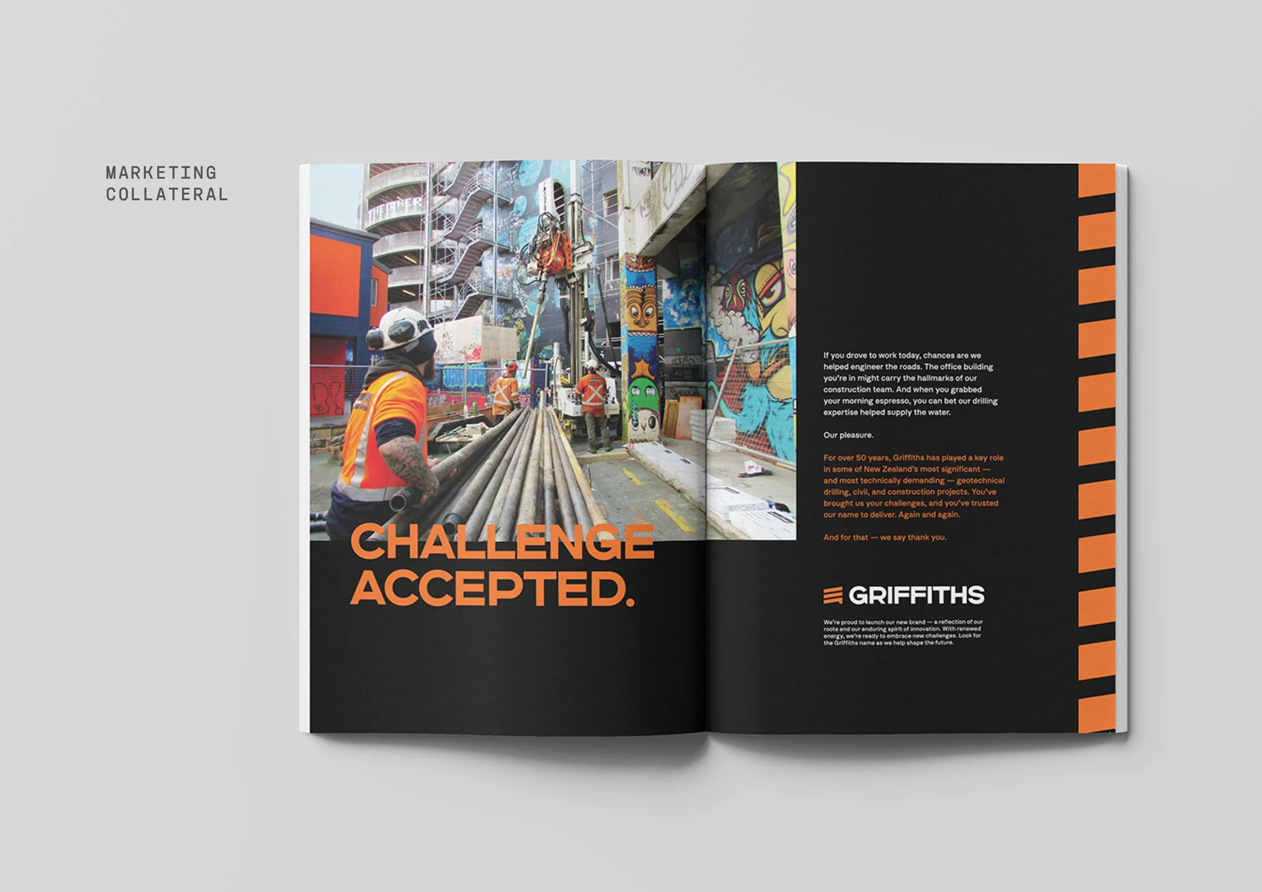
We launched the new brand with a striking double-page advertisement in an industry magazine. This was a fantastic way to reaffirm Griffiths as an industry leader and tell the story of their new brand.
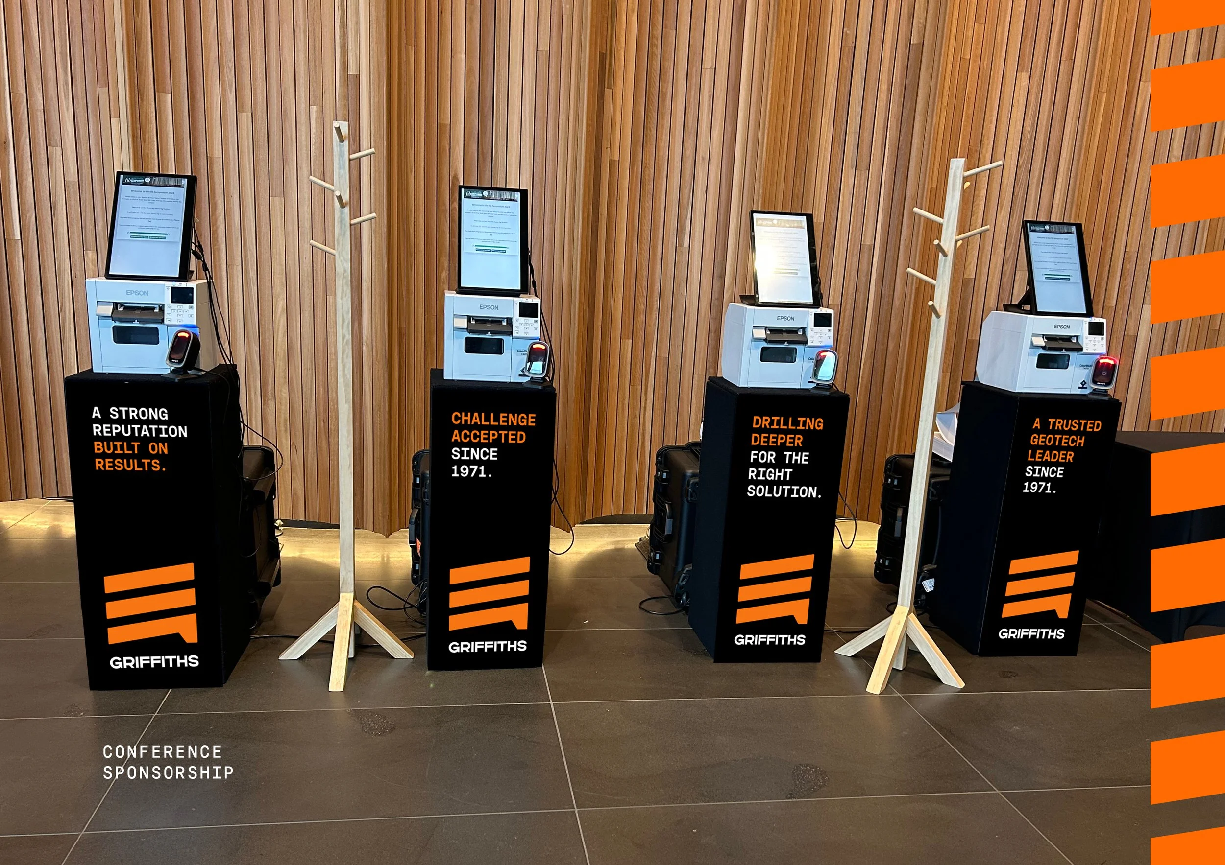
Griffiths is the key sponsor of an upcoming industry conference which will feature signage that presents key brand statements.
OTHER COLLATERAL
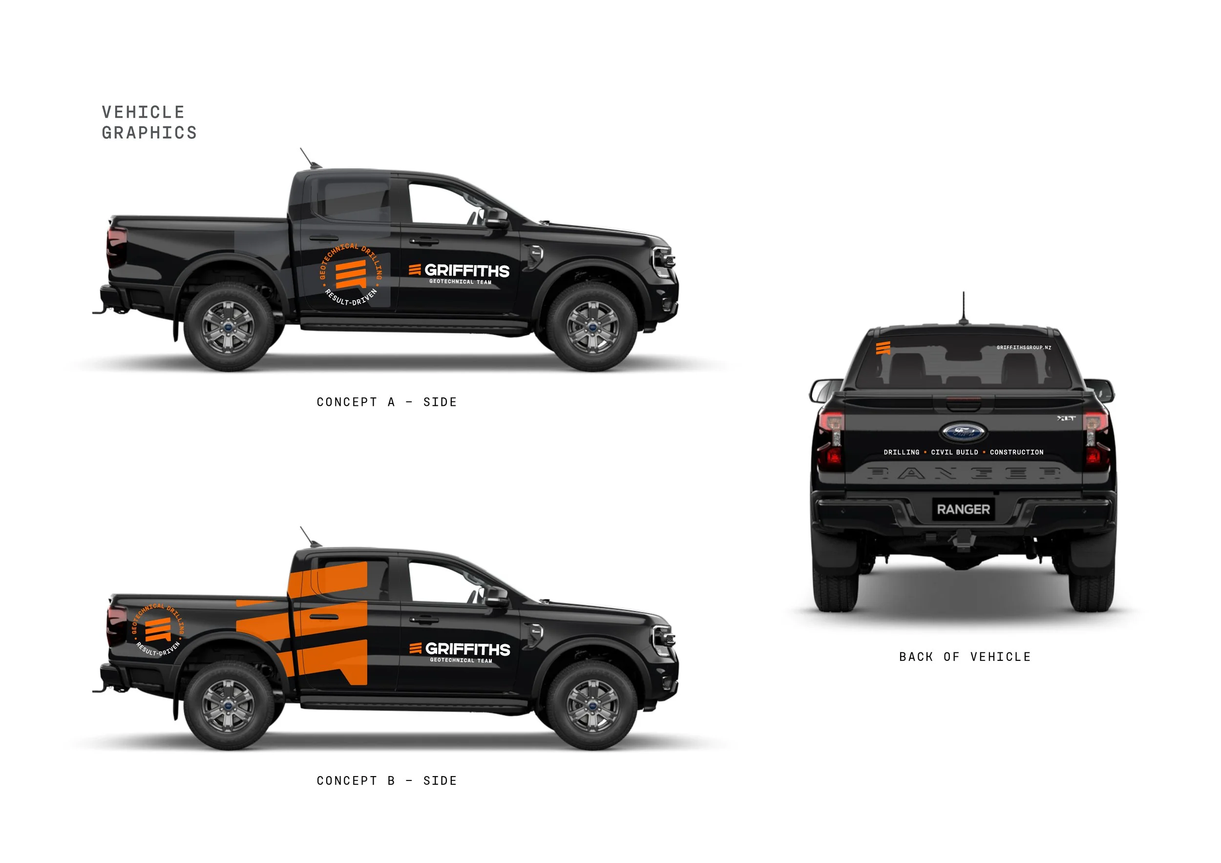
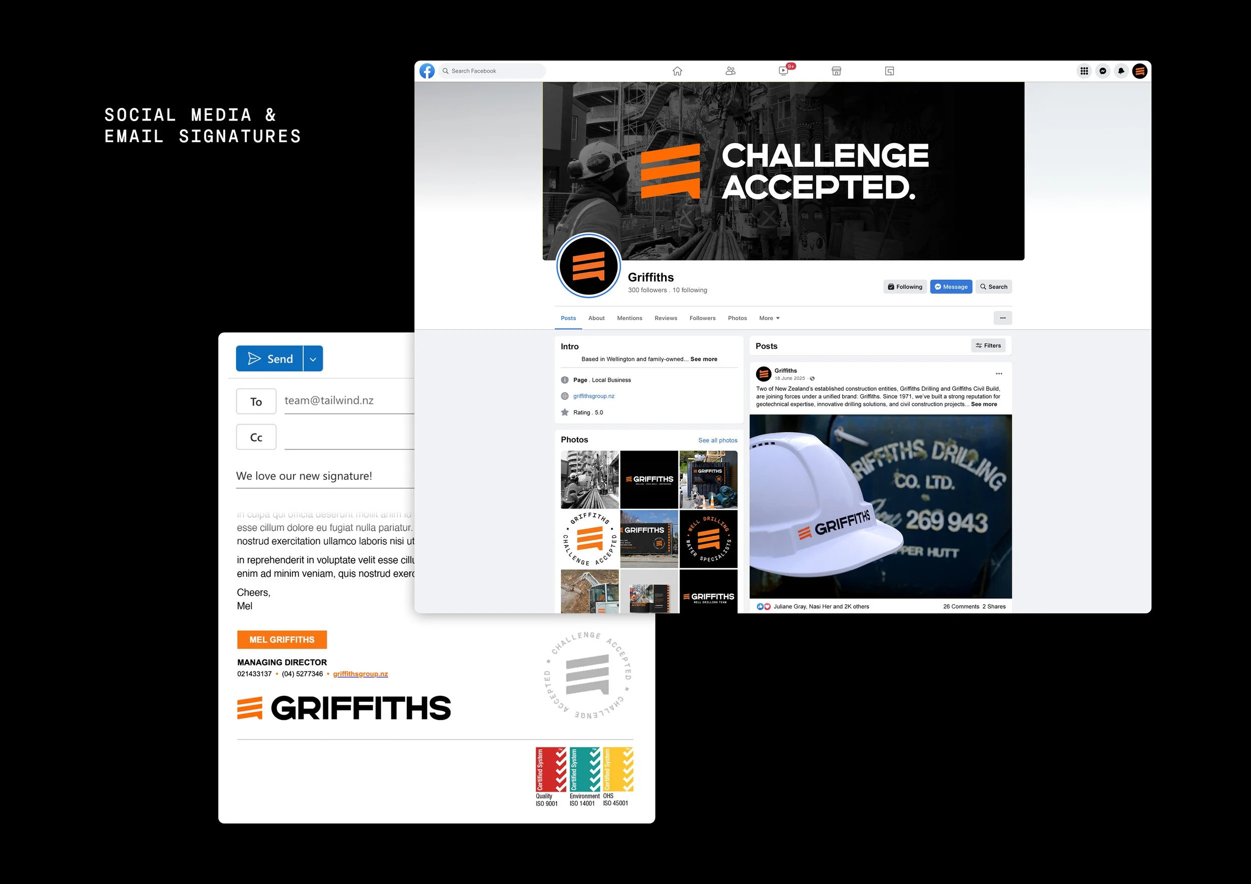
As part of any rebrand we also create these workhorses of the day-to-day operations of any business: business cards, letterhead templates, vehicle graphics, email signatures, social media setup. All feature the key elements of the new visual identity and create a memorable and consistent thread that links to everything else that features the brand.