
Accessibility

At Tailwind, we’re committed to making your brand and website clear, readable, and usable for as many people as possible.

Accessible design makes websites easier for everyone to use, improves search visibility, and is now an expected part of meeting many government web standards in New Zealand and worldwide.

More importantly, it ensures no one is left out: whether they have a disability, use assistive technology, have limited connectivity, or are simply viewing your site on a different device. With digital platforms at the heart of how we live and work, creating inclusive online experiences is both a responsibility and a smart business decision.

In New Zealand, around 851,000 people (17% of the population) identify as having a disability, and that number is growing as our population ages. Without accessible design, a large group of potential users and customers can be unintentionally excluded.
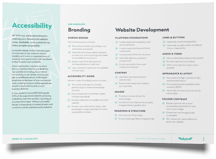


Branding

Accessibility is incorporated across all of our brand design packages. This includes:

Ensure the primary logo design is as accessible as possible Ensure the brand colour palette includes at least two colour pairings that meet accessibility best practice Ensure important elements remain distinguishable at small sizes Create logo variations optimised for legibility at small sizes
A collection of brand guideline pages for SONIK wall linings, showing logo variations, color palettes, and design elements.

Accessibility Guide

As part of our Market Leader design package, we include accessibility recommendations in your brand guidelines document. This includes:
Test colour pairings for contrast and provide the primary logo in monochrome/high-contrast formats Ensure large and standard text meets accessibility contrast standards Provide additional accessible colour options if required Provide clear examples of safe brand, colour, and typography usage where accessibility is important
Stack of black Insol capabilities portfolio booklets with a blue accent on a light surface
Images Provide accurate alt text for every image Include full descriptions for complex images such as charts and graphs

Website Development

Platform foundations Enable keyboard navigation and visible focus indicators Create responsive layouts for all screen sizes Use semantic HTML to support accessible page structure Add ARIA labels to standard interface components Ensure forms and commerce checkout experiences are fully accessible
Appearance and layout Test content in high-contrast modes and inverted colour settings Ensure text remains readable when scaled to 200% Never rely on colour alone to communicate information
Content Use clear and descriptive button and link text Ensure every page has a unique and accurate title
Links and buttons Make links clearly recognisable and easy to identify Never rely on colour alone to indicate links or interactive elements
Colour contrast Ensure contrast ratios meet accessibility standards for text, icons, and images Ensure text displayed over images or video remains readable Test colours for colour-blind accessibility and greyscale visibility
Headings and structure Use only one H1 heading per page Ensure headings follow a clear and logical hierarchy
Audio and video Allow audio and video media to be paused, stopped, or controlled by the user Provide captions for all video content Offer transcripts for audio content where possible

Let’s chat

Talk to us today about your next website project, built with accessibility in mind.